Gustini, the renowned Germany-based online marketplace known for its exceptional selection of Italian products, celebrates its 15th anniversary with a significant brand refresh. Founded in 2008 by Jens Depenau, Gustini has made a name for itself by offering a range of authentic Italian goods sourced from small, local manufacturers to an international clientele. This milestone is marked by the introduction of a new logo and brand identity, expertly crafted by the design agency Koto, signaling a new chapter for the company.
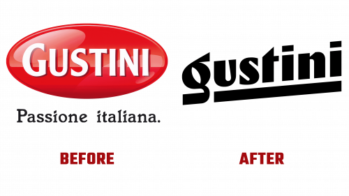
The previous Gustini logo, characterized by its drop-shadowed white typography set against a red oval background, was a nod to Italian culinary traditions, reminiscent of classic Italian food brands. While this design effectively positioned Gustini within the Italian food sector, it became outdated. The rebranding effort was initiated to address this issue, moving away from the old aesthetics to embrace a more contemporary and distinctive look.
The new Gustini logo is a testament to modern design principles, blending a vintage feel with a fresh and innovative approach. It features a lowercase, italic, sans serif wordmark with high contrast, achieving a delicate balance between being strikingly new and comfortably familiar. This design choice evokes the essence of iconic Italian brands, offering a playful yet confident visual identity that stands out in today’s competitive marketplace.
The redesign features unique letterforms that, while individual, create a harmonious and attractive appearance. A bold underline further enhances the logo’s playful optimism and utilitarian confidence, contributing to its standout character. Including a charmingly designed “g” adds a personal touch, encapsulating the brand’s dedication to craftsmanship and quality.
Accompanying the new wordmark is a vibrant primary color palette and Sunset Gothic font from Colophon, which provides a robust and versatile typographic framework for the brand’s visual communications. This color scheme, applied to alternate logo badges, reinforces the vintage Italian packaging aesthetic, resonating with Gustini’s commitment to authenticity and quality.
However, applying a Roughen effect to the supporting identity elements has sparked some debate. While intended to convey a handmade, artisanal feel, this choice has been critiqued for potentially detracting from the overall quality of the design. Nonetheless, this minor concern does not overshadow the effectiveness of the rebranding in capturing Gustini’s essence as a purveyor of fine Italian goods.


