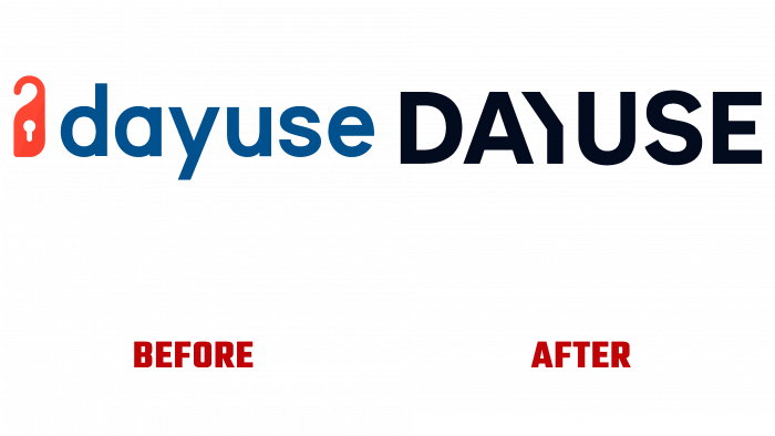
Dayuse.com presented its new identity, created in a new dynamic and modern design, attractive and distinctive in its new role. DesignStudio (London, UK) took up the task of redesigning the appearance of the portal. Providing comfort and convenience to its clients, the hotel booking portal for the daytime offers options as a transit holiday or meeting friends, partners for a few hours, and a daytime luxury room with all conveniences. For more than ten years in a row, the portal, founded by David Lebée, Eugénie Lebée, and Thibaud D’Agrèves, has helped people find daily orders, book a room for only a few hours. But traditionally, in such structures, there were no such proposals, despite the great demand. Dayuse.com has made daily bookings affordable for most people. Together with the brand, customers get the opportunity to enjoy all the benefits of a modern hotel room during the day at affordable prices, which is only possible at night.
First of all, DesignStudio set about defining a unique style and taste. She has created a kind of cocktail of two elements – “honey and ginger.” The first “ingredient” is uniform, smooth, without “seams,” and demonstrates stable functionality. At the same time, it provides the comfort of using the program, some warmth, and even recognition. The second is active, which has an unexpected impact on the user. It is a variation of a punch that is daring but playful. Everyone can find passion and romance in it. Everything is here – both officialdom and danger, in thoughtful doses of “honey and ginger.” The brand turned out to be unique and inimitable.
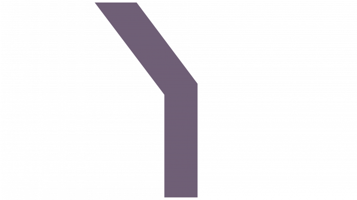
The dial placed on the logo characterizes the time. The created visual impact on the viewer, consisting of a mosaic of different time moments, is a gamut of moods – a window for managing time or using a service. The mood is set by the shades of the daytime palette – both in the colors of the brand itself and in the photographs, which are used to emphasize the service’s features. The moments from which the tapestry of moods and proposals is “sewn” create calm concentration and piquant romance during the day. All of this is completely different from the traditional design of the services provided by hotels. Dayuse.com blew up the conventions in its field by demonstrating other possibilities. At the same time, there is nothing complicated in the logo – conciseness and simplicity are the main characteristics of the new identity. The accent element of the lettering is a stripped-down “Y,” which attracts the eye, ensuring memorability and recognition.


