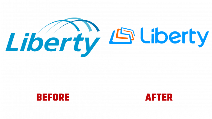
Liberty is the leading Puerto Rican communications, technology, and entertainment company in the world. On September 28, 2021, the company celebrated the anniversary of its foundation with an update of its style, a new logo, and an original slogan – “Tu mundo, mejor conectado.” In addition, the brand presented new offers, including additional services of various types of television – mobile, fixed, and other combined offers with double speed for home Internet and commercial structures. Such additional inclusions in the package of proposals made the company the most interesting for the consumer. This is because add-ons provided a better way of being, ample opportunities for communication with those who are especially important or dear, regardless of their location, using any gadget. At the same time, the speed and quality are several times higher than the performance characteristics of any other company.
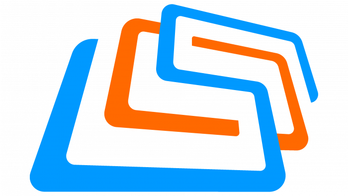
The new brand image reflects the continuity of the two leading telecommunications companies, Puerto Rico, which is highlighted by the blue palette of the logo. The brand’s corporate identity represents a new beginning, real freedom, and the union of the best services under one roof. The main element of the logo is the icon of the so-called “connection portal.” The sign is a symbol of the unity of entertainment, the Internet, and mobile services. The text logo was executed in a medium-sized font in blue. It was based on the typeface Ascent Pro Semi Bold Demo by Fontop. In the font, the corner of the end of the letters was cut off, in the letter “L,” it was made smaller, and in the letter “y” and “e,” they became sharper. This provided a vivid individuality of the text, its simplicity, and ease of reading and memorization.
The presence of orange elements adds energy and passion while highlighting the existing Liberty offerings. At the same time, such a composition demonstrates the company’s tasks, among which the most important is the creation of 100 new access points to the brand’s services. Combined options will greatly value the proposals – new digital channels and a stable service schedule for all channels and points. In this direction, the most effective experience will be considered, and the most practical and affordable innovations will be applied.
The new style most accurately reflects the essence of the brand’s strategy, fully coinciding with the corporate logo. For a clear separation and simultaneous recognition, only a different palette shade was applied – green.


