A promising event that will take place in a little less than 300 days – the enchanting derby show in Kentucky, is being announced now.
Churchill Downs decided to create excitement and released a special logo for the official release, symbolizing this bright event. In connection with the coronavirus pandemic, many regulars of such events were madly bored by their favorite entertainment. And the fact that the public is lured to the event with the logo forced to admit longing for vivid emotions, to engage in a perky game reflects the state of mind of all people tired of dullness during this difficult “COVID” time.
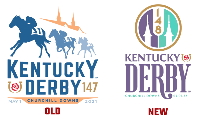
Two key symbols of Twin Spiers, the brainchild of Churchill Downs horse racing betting company, are featured in the logo. The two species with lavender and green shades of background, separated in the middle by a combination of numbers 1-4-8 with a white capsule-shaped shadow, framed by a light brown circular outline, is the main emblem of the company. Added to this is Kentucky Derby lettering in various fonts to show the “historicity” of the Derby tradition itself and the modernity of the place where these races will take place. And the red rose, bordered by the light outline of the horseshoe, testifies to the romantic nature of the meetings at the derby, which will take place on May 5, 2022.
The agency that developed the logo, MogoSME, handled The Derby and Oaks 14 years ago. The long-term friendship of the partner companies has borne fruit: the audience is intrigued, the event is interesting, and it is being prepared. The new logo will appear on merchandise such as goggles, jewelry, and other accessories accepted by the racing community.


