Well known in the public transport, concert, and sports circles, SeatGeek has been helping select tickets on its platform for over ten years. Thanks to the mobile application and website, many regulars from different interesting places chose their places and enjoyed the atmosphere of different events. If someone could not attend your favorite event, this platform allows you to exchange or resell a ticket.
Numerous sports-oriented companies, organizers of mass events in the music and film industry, and theater directors have joined the company’s activities. For example, SeatGeek has become the Official Ticketing Partner for Broadway Theaters. And every year, the profits and users of the platform stay, which guarantees the growth of interest in the brand in the future.
Design teams from New York and California worked on their parts to update the image: Mother Design, who was in charge of the overall strategy, Orange County, Hoodzpah, Mickey Duzyj. The main ideological message is as follows: times go by, and people, as they wanted bread and circuses, and from century to century, will be happy to attend various entertainment events. This business is always held in high esteem by connoisseurs of cultural institutions, concerts, tournaments, and other general gatherings. People like to spend time together; it unites both at work and on vacation. And over time, the old logo has already become dilapidated.
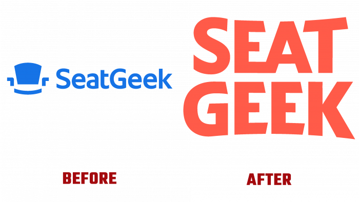
The depicted chair-sitting of the blue shade of the old-style logo, made in a simple style, does not attract our contemporary. In the era of digitalization, you need to quickly attract a client or buyer, provide complete information in the first 10 seconds. This time, the graphic image of the chair was removed, leaving only the type logo using the Kabel-Esque font. And it resembles a seat in convex orange shapes because the letters bent, like places in some, say, a cinema, in a circle. This creates the impression of an arena, stadium, theater. The link is direct to the meeting place, and only the user himself knows what exactly awaits a potential user of the SeatGeak application.
It should be noted that the old logo was a pretty cute reflection of the brand’s essence. The new one only keeps up with the times. This is the era in design, when the simpler, the better, and brighter. By the way, the orange tint does not interfere with the perception of the shape of the letters, which are located in two rows and divided into two halves the word-name of the company.
Original, beautiful, new. No wonder the whole team put in the effort to design different parts of the logo. They have combined brand values into one whole, which attracts users with its positive color and shape even more.


