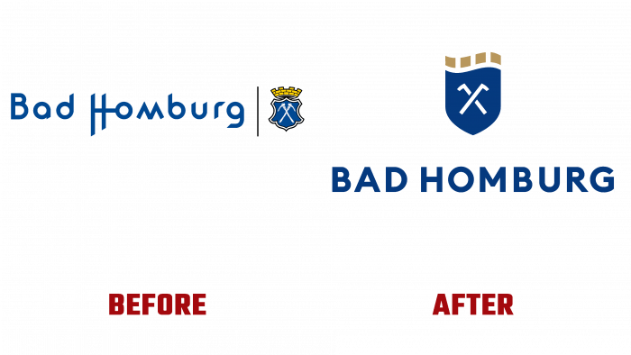
The history of cities has always attracted attention. And this made the desire of each municipality to make it more representative and memorable. This also affected the emblem of the city of Bad Homburg vor der Höhe in Germany, located on the land of Hesse, which the Urban Media Project studio developed. The city has a long history dating back to 1180. Its coat of arms was officially adopted in 1903. However, the forms of the coat of arms can still be found on the letters of the 15th century, where it was placed as city seals. But there is an element in this coat of arms, the appearance of which cannot be explained. These are two crossed teslas. The difficulty of reading what was depicted on the ancient seals most likely led to a possible mistake by the developers of the coat of arms at the beginning of the 20th century. The presence of the St. Andrew’s cross on the ancient version is supposed to be more possible. But this element was also used in the new logo in a conditional design, resembling a crossing of a golf club or a hockey club, but not even an adze.
The new interpretation of the city’s emblem looks quite modern and impressive. However, the spirit of historicism was almost completely lost in it. Having retained the traditional colors of the coat of arms and the city – blue and white, the developers nevertheless “swung” at the story, making the central elements of the logo even more problematic and completely depriving it of its main pride – the crown, which was replaced with golden cubes. Yes. It became timeless, both the current and the future, but also the past, from which it became divorced thanks to the design decision. At the same time, the shield itself was simplified to a traditional execution, or rather a hint of its traditional form, completely abandoning the execution of its original historical form, characteristic of the coat of arms of this city.
A fairly free interpretation of the city’s history and the ease with which the emblem was denied its historical correspondence do not allow evaluating this work from the point of view of cultural, spiritual, and historical value. Especially in the typographic version, this emblem is memorable and easy to visualize. The “wave” created by the cube and the top of the shield has several symbolic meanings. This is a unique location on Taunus, and the fresh autumn wind, called “champagne air,” and healing waters, because of which the city has a special status of a resort. It is possible that the title of the Resort became the real reason for the depiction of golf clubs as sports equipment for recreation on the emblem.
The text of the logo plays a special role – the name of the city, the font of which is very easy to read both in print and digital form. The first phrase is in Possible Bold by K-Type – bold and solid. The text underneath is in a thinner typeface like Arazati Negrita Expandida by Underground, which contrasts very effectively and directs the eye towards Bad Homburg. The font makes the logo readable in any size design and combination with other advertising elements.


