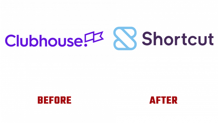
The renowned software service provider Clubhouse has announced a name change to its users. The new name has already been announced. Shortly, a complete rebranding will be carried out; the company will become a Shortcut upon completion. The need for such a drastic change was prompted by the actions of another company that bore a similar name – Clubhouse Audio, which is a chat application. But until some time, this situation did not cause any particular difficulties and conflict situations.
That all changed when Clubhouse Audio acquired a new domain name this spring, Clubhouse.com, which secured the lead in search engines when users type in the main brand name Clubhouse. As a result, the original company with the domain name Clubhouse.io was at the bottom of search results, negatively affecting the image so important to its business. The problem that arose in finding a solution to it prompted the process of a complete brand renewal. Naturally, the fight for brand awareness requires a lot of effort, time, and investment. But in this situation, there was no other way out.
However, the owners of Clubhouse.io found a less painful solution to the problem – there is an unconfirmed proposal that the company could acquire a promising new domain name – Shortcut.com, which was the reason for the complete renaming. The management believes that in combination with the existing base of regular customers, deep marketing, large financial investments, and a promising domain name, it will survive the event less painfully and quickly regain the lost position.
The new name will not be tied to the history of the brand’s development. But its meaning will be able to more accurately and fully convey the goals and methods of solving the enterprise’s problems. The search and proposal of the shortest path, the most rational way to achieve the goal, is exactly what the company provides to its clients. The design of the new logo does not repeat the previous one. The only thing left of the “old” font is the color of the font that will be used as the background. And the new one turns white. This will not change the font type. A stylized “S” will appear in front of the company name with a blue outline. Its combination with a shade applied as a background is somewhat painful to the eye. But, most likely, this was the purpose of the designers, to get the attention of Internet users.
At the moment, an attempt to switch to a new domain name is still completed by redirecting to the old address. It remains only to wait to see how effective such a daring plan proved to be.


