For many years now, the famous Cleveland Guardians have been defending their homeland from attacks from different opposing teams, season after season. More precisely, the professional American baseball team was assembled in the century before last – in 1894. The brand’s franchise was originally owned by the Grand Rapids Rustlers, a minor league team in the Western League. The team won 10 significant titles, 6 American League pennants, two championship series, the first in 1920 and the last in 1948, setting an interesting precedent. Thus, it became the longest World Championship Cup streak held among 30 Big League teams.
In 2020, we decided to improve the logo, changed the name. All the supporting facts indicate that the process of introducing a new team image is in full swing; therefore, as soon as all formal agreements are reached, a full-fledged new look for the Cleveland Guardians will see the light.
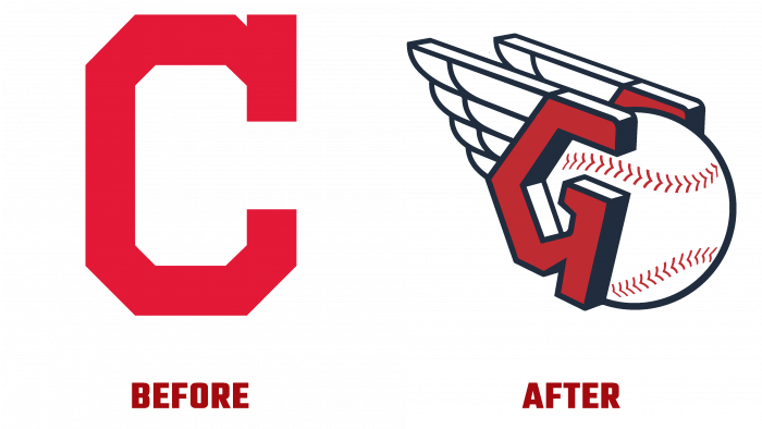
So, examining the old logo, we note that there is a trademark mark and only a hint of the name thanks to the scarlet letter C. The font is square, pointed. This does not attract attention with brightness; rather, it only emphasizes the “nakedness” and excessive simplicity. Perhaps in terms of selling merchandise, this is a good tactical move. But the brand wanted latitude and altitude.
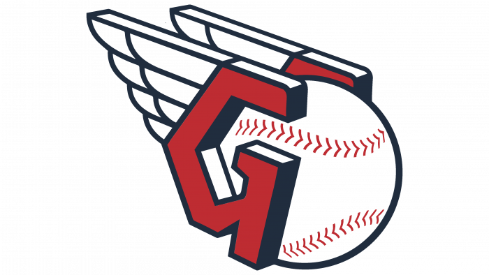
Authentic, contoured wings, supported by red C and G as part of a protective helmet, 3D letters, and a ball sandwiched by them – all this is the new hallmark of the Guardians.
The dynamics, speed, weight, confidence, direction, and result, and concentration are shown. It is amazing how the design could reflect the essence of the game of baseball and the nature of Cleveland sportsmen only by technical means that do not depict a person.
Of course, the main message of the new logo was to show respect for the game, a tribute to the champion’s past, prospects for the future, and the identity of the people of Cleveland. Protection, support, awareness of oneself as part of a large community, in which common values and high standards reign, is an invariable intangible component of this graphic image.
The logo is simple, unique, and alluring at the same time. I would like to consider more savor every detail because each element carries a hidden meaning. Be it the inspiration and desire for victory (wings), support and partnership of team members (like letters standing opposite each other), speed, endurance, players’ power, and the potential of the game for the entire edge as a whole (ball).
Thanks to this logo, guardians have become real protectors; now, no one can confuse a graphic symbol with a fast-food symbol or a clothing brand. A successful and inspiring new image that attracts fans of a productive and beautiful baseball game.


