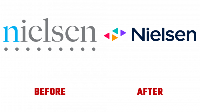
Founded back in 1924, Nielsen today provides the formation of the world’s media, their content. They are conducting an accurate analysis of the target audience, data, and analytics through a clear understanding of people, the ability to accurately “read” potential consumers, their behavioral motives on a wide variety of channels or platforms. This approach opens up great opportunities for users to obtain independent and actionable data to communicate and interact with their audience. The company covers over 55 countries. Visual changes contribute to the creation of a modern, bold and dynamic brand. The new strategy promotes the brand’s primary goal of providing a better media future for humanity.
The brand logo represents the trademark and text name of the company. The symbol is a set of buttons using playing arrows of different colors that make up the control panel. Their diversity symbolizes the richness of the media. The emblem has an accentuated letter “N,” which is the main link that conveys the leading role of Nielsen, promoting and developing not only the logo but also the understanding of the essence and spirit of the brand. The font is quite bold, which makes the text well readable in any form. The whole composition is very original; it is easily perceived visually. The simplicity and conciseness of the logo make it especially easy to remember and modern.
The graphics are quite original. Numerous colored triangles represent a style called the spectrum of motion. All colors are chosen in a flexible gradient, in beautiful vibrant hues. Each triangle symbolizes a specific piece of data – a music file or show, an audience member, or a content creator. At the same time, they are used as a visual framing that propels media files forward. The color palette for screens, which reflects the variety of informational content and users, is very effective. An energetic and constantly evolving palette, bold and fresh, even distinctive, changes the design’s dynamics, bright and expressive.
Interesting is the simultaneous acceptance of the general similarity of the graphics of the Nielsen and Newsy logo, the development of which took place at the same time, regardless of each other. However, the Nielsen variant looks more proportionate and more attractive.


