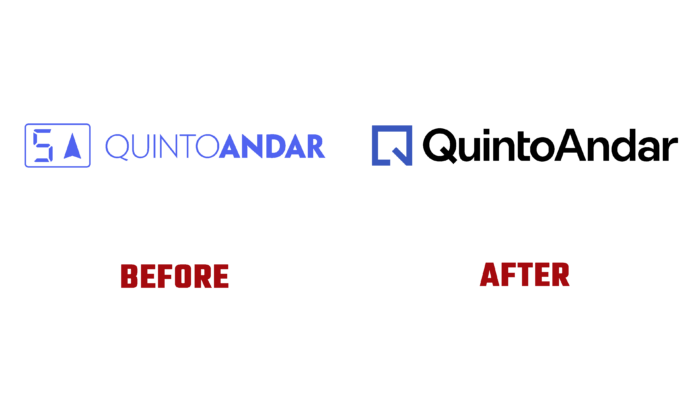
Founded in 2012, the Brazilian digital real estate technology company QuintoAndar has been in the service of people for ten years. It simplifies the lives of those looking for a new home or property who want to rent property in Brazil. Over the years of its existence, the company has become the largest in the country. The application, available in 50 cities, allows the implementation and control of each stage of registering a lease or sale in real-time without direct human influence. Thanks to a small but effective application, processes are accelerated several times. The brand carried out its modernization to meet modern requirements, significantly reducing its identity’s visual load making it clearer and simpler.
The company’s visual identity acquired clearer visual boundaries, which helped to highlight and emphasize individual elements. The new identity gained scalability, supporting the company’s overall drive for global expansion. At the same time, deep work was carried out to ensure the balance of all the interconnections of the visual identity, which was complemented by emotional elements – illustrated stories about the close relationship of people with their own home.
As the main symbol, a figure in the form of a square was created, whose execution creates the perception of a stylized letter Q – the first letter of the brand name. The open shape symbolizes the brand’s openness to everything new and the willingness to expand customer reach by increasing its capabilities, demonstrating a willingness to go beyond its region. At the same time, the symbol refers to the geometry of drawing up floor plans. The lower corner – a schematic representation in the plans of an open door is an option to demonstrate the willingness to use various spaces and connections using this electronic platform. In the new logo, the use of a bright monogram with a slash greatly simplifies visualization. It makes it easier to move from understanding the symbol as an element of the plan to understanding its commonality with the letter. The Oatmeal Sans Pro font from BoulevardLab used for typing adds credibility and solidity to the logo.


