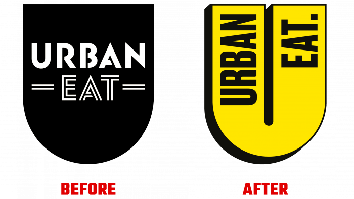
The new designs of the Urban Eat product line have exploded the internet with unexpected packaging solutions. The new logo design completely breaks down the implicit boundaries of design, changing views and directions. One of the main tasks that Robot Food set for itself was to apply the brightness of the color gamut, versatile patterning, and various unexpected illustrative materials. Everything around was supposed to become colorful, crazy, tasty, accessible.
It was very important to correctly approach the traditional conventions that “tie” colors to certain products. And break them. For example, for chicken, it is yellow, and for ham, it is pink. To reflect the essence of the product, under the packaging, inspiration was taken from real art, more illustrative than just some kind of “cheerful” bright background. Intricate patterns and textures in Memphis shapes and styles or images by Keith Haring, Matisse. Applied original effects of photomontage and cutting, printed graphics, and much more.
The pop-art style also played a special role in shaping the packaging. It made good use of the illustrations on the side, which featured photographs of the ingredients that make up the product. With short and vivid slogans, the composition has acquired some surprise, beneficial for the viewer, adding imposing and usefulness. At the same time, it is making sure that the day will not be so favorable without the new Urban. It will simplify their daily routine; everyone will become a true adherent of constant change only in Urban Eat. Everyone will strive to experience more of all the delicious options, regardless of whether there is a desire to try something new or, conversely, to find something that has been desired and familiar for so long.
Visual and color effects are the basis for the formation of a new logo. With their help, the packaging was supposed to take the consumer out of the stupor, not only during the traditional break. The new identity is pushing for changes, for abandoning old and decayed habits. All the more so when all this occurs in a diverse urban environment full of different cultures, original characters, styles, and the most unexpected color shades. At the same time, the color scheme is an effective element of stimulating appetite.
The main logo is designed in bright yellow tones, which stand out very clearly on the background with a shadow. The brightest and most attractive color shades have been selected for additional options. The logo itself – the letter “U,” which is the capital in the name of the product line, is made in the form of a thick staple, whose front surface allows to apply a readable text of the full name. Below it, on a plate in the color of the “mother’s” logo, the product’s name hidden inside the package is in black.


