


![]() New Orleans Pelicans Logo PNG
New Orleans Pelicans Logo PNG
The New Orleans Pelicans emblem’s broad scope and proud appearance are precisely conveyed by its depiction of a massive bird, a symbol of invincibility in any situation. Will, determination, resilience, and courage are all present in this emblem. There is also a love for the city where the basketball club is located.
The Charlotte Hornets began in 1988 and joined the NBA in 1989. The name came from a fan vote, replacing Charlotte Spirit and referencing the city’s role in the American Revolution. The early identity drew attention with an unusual mix of turquoise and purple, a look later echoed by teams such as the Vancouver Grizzlies, Detroit Pistons, San Jose Sharks, Florida Marlins, and Jacksonville Jaguars.
Through the 1990s, the team built a strong local following, though structural issues began to develop. By the early 2000s, disagreements between owner George Shinn and city officials over a new arena led to the team’s relocation. In 2002, the franchise moved to New Orleans, retaining the Hornets name despite losing its original historical context. The color scheme remained largely intact, with gold added and a yellow alternate uniform introduced in 2004.
In 2005, Hurricane Katrina forced a temporary move to Oklahoma City. For two seasons, the team operated as the New Orleans/Oklahoma City Hornets, adopting an identity that included references to OKC. In 2007, the franchise returned to New Orleans and updated its branding, adding symbols tied to local culture, including the fleur-de-lis and references to NOLA.
In 2013, the team rebranded as the New Orleans Pelicans, reflecting the Louisiana identity. The Hornets’ name was transferred back to Charlotte, restoring the brand’s connection to its original city.
Meaning and History
![]()
The New Orleans Pelicans, formerly the Charlotte Hornets, once wore a cartoonish hornet as its emblem. But this did not last long: In 2014, another symbol was adopted, which looks progressive and corresponds to the current name. The team’s new owner, Tom Benson, took care of the team’s image, ushering in a modern era in Louisiana basketball history.
What is New Orleans Pelicans?
The New Orleans Pelicans basketball club is one of the five participants in the Southwest Division (NBA). It appeared in 2002 following the relocation of the “Charlotte Hornets” to New Orleans. Initially, the team was called the “New Orleans Hornets,” and it acquired its current nickname in 2013.
1989 – 2002
![]()
The “Charlotte Hornets” emblem depicted a blue hornet with a sharp sting. The image is anthropomorphic, as the insect has arms and legs. Also present are attributes of a sports theme: white sneakers and a brown ball. They associate the logo with a basketball club. The same function is performed by the inscription “CHARLOTTE HORNETS,” which is divided into two parts and surrounds the drawing from the top and bottom.
2003 – 2008
![]()
In the 2002-2003 season, the franchise moved to Louisiana and was renamed the “New Orleans Hornets.” After the move, the emblem remained practically unchanged: the designers only repainted the ball in yellow, updated the city’s name, changed the font, and made the letter “H” on the hornet’s chest more noticeable.
2009 – 2013
![]()
Changes to the logo from 2009 to 2013 improved the graphics, while the layout and design were carried over from the previous logo. In 2009, the cartoonish hornet resembled the official team mascot, Hugo the Hornet. The blue color became darker. The drawing’s blue and navy blue colors became brighter, and the ball acquired more natural contours and color. The only change was replacing the “Charlotte H” inscription on the hornet’s chest with “NOLA” (“New Orleans”).
2014 – 2023
![]()
In December 2012, the club announced a name change to the “Pelicans.” The rebranding allowed the club to separate from the franchise that originated in Charlotte and moved to New Orleans. The nickname “Hornets” returned to its historical homeland and became the foundation for another team of the same name. The New Orleans Pelicans debuted in the 2013-2014 season with an updated logo, completely different from retro versions. The new colors were dark blue, gold, red, and white.
Moreover, the basketball team’s symbol became the pelican. The New Orleans Pelicans emblem has an unconventional shape and a blue background, with the inscription “New Orleans” written in white at the top. Slightly below is a white pelican head and gold wings. The animal holds a golden ball in its red beak. At the bottom, the word “Pelicans” is written in white letters in a red semicircle. A golden outline also frames the entire New Orleans Pelicans logo.
2023 – today
![]()
Font and Colors
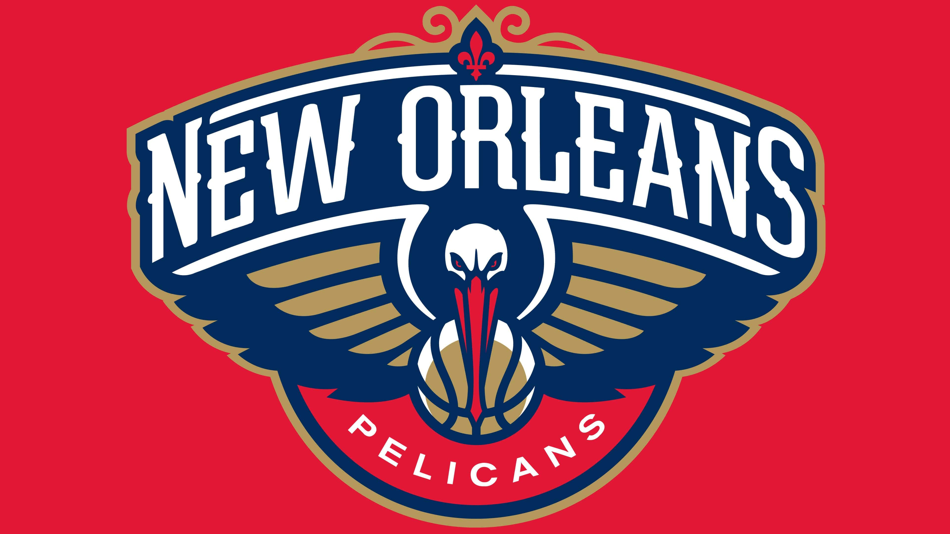
The modern club sign contains the head and wings of a pelican (viewed from the front), a golden basketball, a white inscription “NEW ORLEANS” on a blue background, and a red semicircle with the word “PELICANS.” Above is a red fleur-de-lis.
The branding studio RARE developed the design. When choosing a new concept, specialists based it on the fact that the pelican embodies the state of Louisiana and is found on its seal and state flag. To make the drawing look harmonious, artists emphasized the wings. At the same time, they tried to avoid the bird’s profile, as they did not want to focus attention on the massive beak.

The phrase “NEW ORLEANS” is written in a stylized old font. There are even more serifs than expected: they are at the ends of the letters and in the middle. The word “PELICANS” is set in a simple sans-serif font.
Colors are selected according to the club’s official palette. Each has a specific meaning and is depicted on the New Orleans flag. For instance, red symbolizes the blood vessels under the pelican’s throat. The emblem is complemented by gold and dark blue.
FAQ
What does the New Orleans Pelicans logo represent?
The logo of this basketball club reflects its name. In the center is the head and wings of a pelican holding a ball in its beak. Above is a beautiful arch with the word “NEW ORLEANS” and decorative swirls. Designers used a serif font for the text, styled to look like old signs. At the bottom is a red semicircle labeled “PELICANS.”
Did the “Pelicans” change their logo?
As of 2021, the “New Orleans Pelicans” have not changed their logo since 2012-2013. The last rebranding involved updating the name, as that was when the team received the nickname Pelicans.
What is the current slogan of the New Orleans Pelicans team?
Since 2019, the “New Orleans Pelicans” team has used the telling motto “Won’t Bow Down.” It was introduced at the beginning of the season.
Who is on the “New Orleans Pelicans” team?
The team roster for the 2021-2022 season includes Jose Alvarado, Devonte Graham, Josh Hart, Jackson Hayes, Willy Hernangomez, Dalton Hommes, Brandon Ingram, Herbert Jones, Kira Lewis Jr., Marcos Louzada Silva, Naji Marshall, Trey Murphy III, Tomas Satoransky, Garrett Temple, Jonas Valanciunas, Zion Williamson, and Nickeil Alexander-Walker.