Not so long ago, the Overflow company entered the world level, which is a platform for implementing charitable projects. Initially, in 2019, the brand positioned itself as a group of active young people who have focused their energies on creating infrastructure to avoid class mismatch and lead to cooperation, at the core of which is growing generosity.
The creatives of the Alright Studio agency (Brooklyn, New York, Brooklyn, NY) emphasized in the course of their work that they immediately felt how innovative approach and innovative product the creators of the brand offer. The initiators accurately foresaw the prospect of growth, scale, and grandeur of their plans, so the logo wanted to reflect efficiency, status, and reliability. In the concept of the new logo, they wanted to depict static, generating movement, life. The brand name hides a great potential, which you cannot see at first glance, but you fell unconscious.
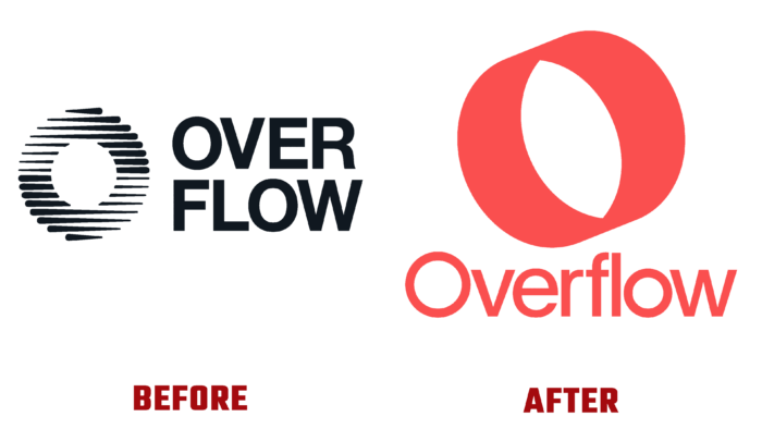
Previously, the logo contained a large letter O, which consisted of graduated strokes of either a brush or a marker, and the main inscription went to the right. It was divided into two parts – “over” and “flow” as if symbolizing a rise above the mainstream. The same circle, aka O, is sized, clear, but the color scheme – from light gray due to thin lines to dark black in bold outlines – did not win at all visually. There is a feeling that someone has put a stencil, painted or painted a writing object inside it, and then left it as it is.
It looked not trivial but vague and too symbolic – there were mini waves in a circle, there was no feeling of flow because it was as if there was water in the circle, like in a pond. On the other hand, these lines in “O” meant cash flow, but they do not resonate in the soul of a potential user.
Therefore, the beautiful berry orange color and the elegant thin font of Universal Sans create an atmosphere of serious intentions, growth, utmost attention, and energy to the project. The fund will only benefit from the rebranding because the color design significantly increases its attractiveness and disposes of itself. By the way, the inscription itself is not divided by levels but is a monolithic word. From now on, Overflow is not just flowed, seething, the movement for the sake of movement. It is also a stop signal for those who, in the rhythm of life, forget about the most important things, do not find time to look inside themselves, understand their values , and look for growth points.


