Renowned American video game developer Riot Games has unveiled its new original update for fans for the second decade since its formation. The brand is known for its developments and as an organizer of eSports tournaments. The most famous it brought the popularity of the world-famous League of Legends 2009. The company itself was founded in 2006 by Brandon Beck and Mark Merrill, with an office in West Los Angeles, California. It demonstrated its unique capabilities practically from the get-go. In 2011, it merged with the world-renowned Chinese investment holding company Tencent, creating conditions for further rapid development and expansion.
By 2016, being a subsidiary of Tencent, the brand opened new offices in major cities around the world. The game manufacturer has created several spinoffs of League of Legends in recent years, united by a common universe of characters. A popular novelty was the shooter Valorant. The merits of the brand were noted, a lot of awards and incentive prizes. Following modern trends and constantly striving to be at the forefront of its field, the company pays special attention to its external identity. This year, it presented its fans with a new, modern and attractive identity.
The new visualization reflects the company’s main goal of continuous success in the long term. The creation of the new logo was the reasonable conclusion of an in-depth analysis of the game developer’s activities throughout its existence. There was an organized holistic visual system, which included the creation of additional unique resources – first of all, unique typography. With their help, it becomes easier for users and players to remember and recognize the company wherever it appears, to distinguish it among the countless hordes of similar structures and manufacturers.
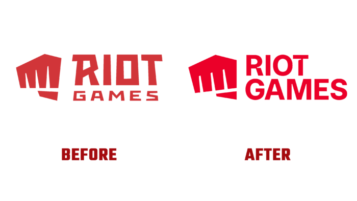
The rebranding was based on the use of modern technology. The wordmark of the logo has become more modern. The chosen font ensured its clear display and easy reading, typographically and digitally. To maintain its original spirit, demonstrating a commitment to its successful history, Riot Games retained the architecture of the logo, relocating its main symbol to the new version. The font has become clearer and easier to read. The signature color is brighter and more saturated, providing the appeal of a new identity.


