



PHD, part of Omnicom Media Group and a global media network, has renewed its visual identity and introduced a new version to its users. These changes reflect the brand’s new philosophy, Make the Leap. The new identity calls on everyone who runs a business or helps others to use the power of imagination to drive successful growth in any direction. Design studio Cosmo Jameson helped bring the renovation to life, applying modern achievements and possibilities in digital technologies, dynamics, and sound effects.

The main task assigned to the performer was to convey, concisely, the brand’s creative achievements and its direction to support clients’ prosperity. Visually, it conveyed the theme’s duality, which, along with Make the Leap, kept the visual language consistent across all directions of the created identity. Using new technologies, we clearly defined the main brand images and created dynamic clips. These moments are especially clear in the brand’s graphic performance, played like an ambigram. The text graphics made it possible to express that reserve of kinetic energy inherent in the brand’s essence. The symmetrical execution and dynamic visual interpretation reflect the logo’s double meaning. In a static form, it makes everyone feel ready to move at any moment.
Through modern visualization, the core values of PHD were conveyed: creativity, courage, openness, a desire for close cooperation, and even the brand’s curiosity. This is reflected in the images used and the accompanying dynamic video clip. Visual horizontal leaps, demonstrating the transition from one state to another, personify the duality of the world in which PHD exists and require constant rethinking. This is one way to help you feel the brand’s true value.
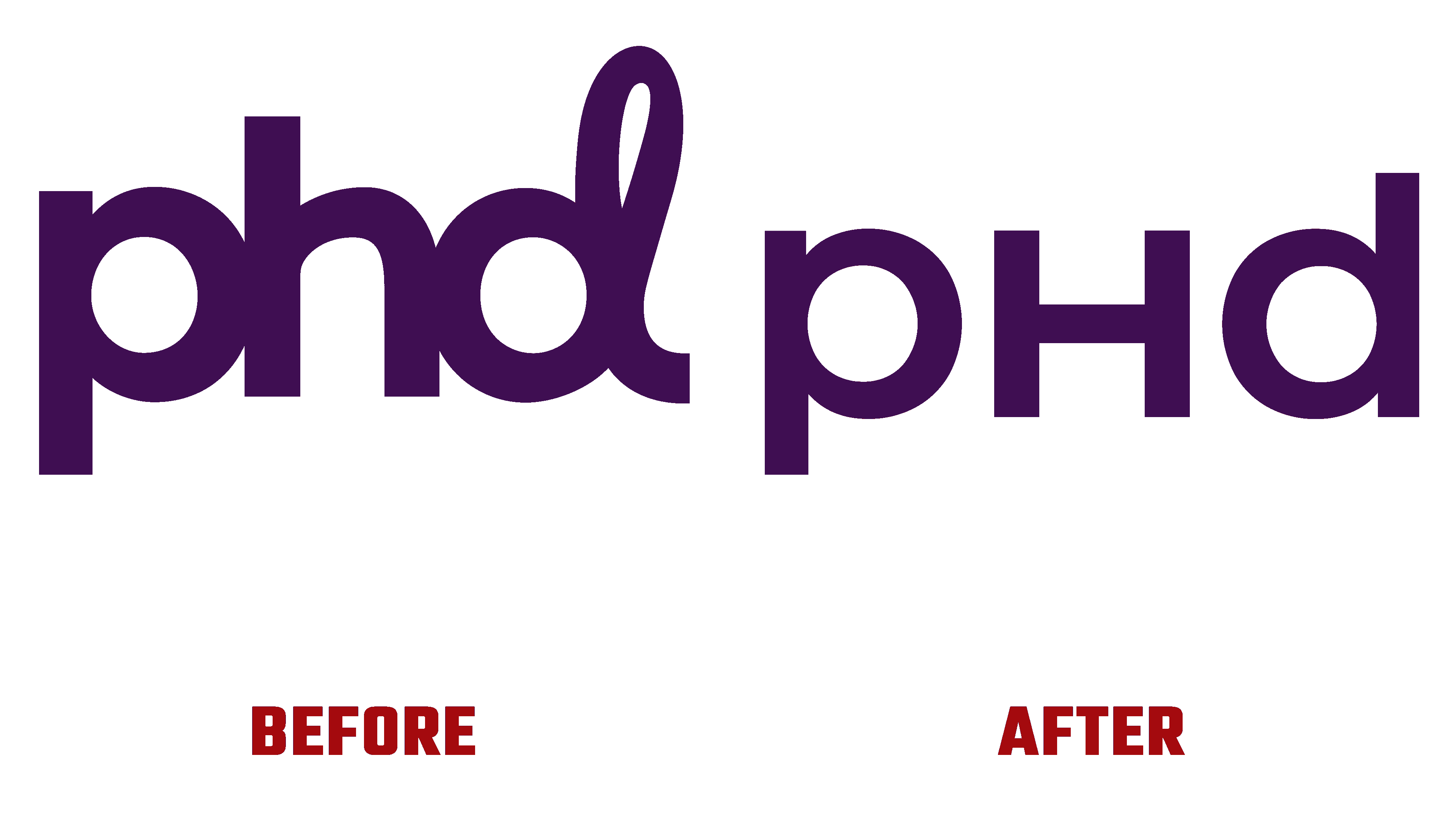
Modern technologies, through sensory dynamics and movement, reflect how the company operates today. In doing so, the new identity has become a real and effective symbol of the company’s ethos. The rebranding demonstrated and confirmed the company’s features: its dynamism and flexibility, and its ability to make a sharp leap forward to open up a new world.