Often, brands that develop products for families and children inspire more consumer confidence than companies with other products or services. The secret is that when developing the identity, the company’s creators do not forget about children. They can also be influenced as an adult buyer and involved in the processes – create a unique logo and, in addition, a flirtatious mascot, bright product design, offer treats and gifts to the product that they choose.
The situation is different with the games industry when a unique intellectual product is created, fueled by an interesting design. Still, the product itself will receive an assessment only when the user tries it out.
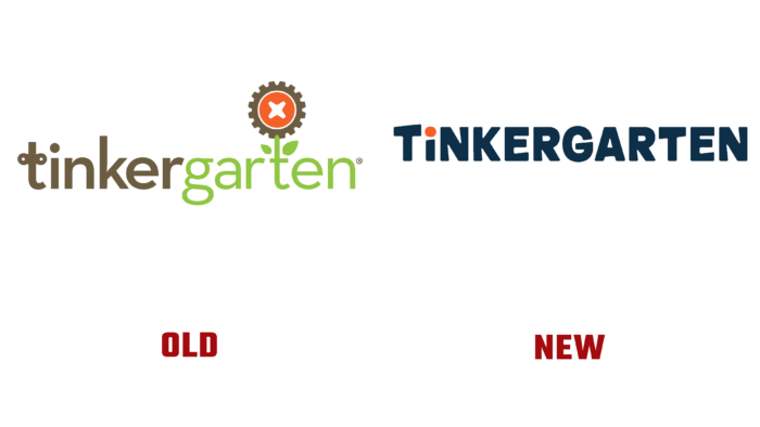
This is also the case with the TinkerGarten brand. The speaking name, which hints at semantic load, brain activity, environmental friendliness, fresh air, and space, suggests a juicy green logo. A key, a detail with a cross in the center on a red circle (a screw or a car wheel), two fonts, green letters are underlining the German word “garden” and the letter “t” in the form of a stem – this is the key to the brand’s success at the initial stage of development.
When trust and authority have been won, you can experiment and make a more concise logo. There is a dark background of a blue charcoal shade, white letters of a monolithic font with a single contrasting element – a dot above the “i,” that’s all there is in the new logo.
The creators of the brand themselves take care of the rational use of the early age of children to lay the foundations for development. Educational experts in the United States have developed a suitable leisure and development plan in harmony with the space for children. Therefore, Tinkergarten organizes the process of involving the whole family in the game in any weather, for all four seasons, and with any game resources.
Maybe that’s why the company decided to incorporate versatility and rationality into the new logo and remove unnecessary details. The update was created by the Moving Brands agency from San Francisco, California.
The abbreviated version for applications, for example, contains only two TGs and a red dot at the end. The animated versions also create the atmosphere of a swinging swing or Lego modules that can be assembled into one long object. They also came up with accent logo screensavers for four seasons, where the sun, flowers, leaves, or drops add dynamics to the overall concept.


