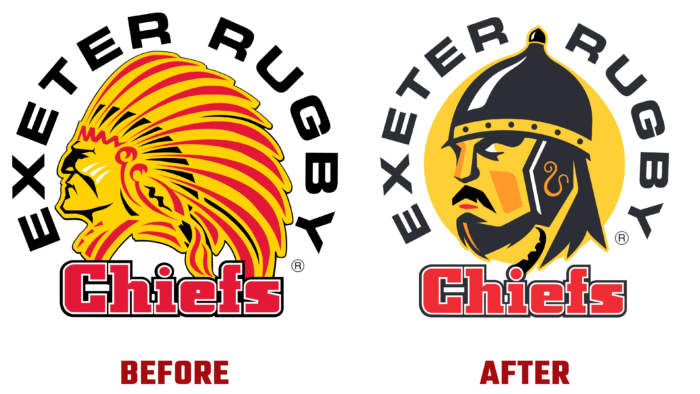
Founded in 1871, the American rugby club has changed its identity dramatically and irrevocably for the 2022 season, which has been notified to its fans in advance. The changes took place against the backdrop of a new policy in society related to the requirement to demonstrate respect for national and indigenous minorities. The club was forced to abandon its traditional-historical Indian themes and reorient its visualization to the distant Celtic past, paying tribute to the leaders of the Dumnoni tribe from the Iron Age, who inhabited this territory of Britain. The new emblem emphasized all the main traditions of the team and its fans. Immediately after the presentation of the revised visualization, the retail chain began to receive goods with new symbols, as the club announced on its social media pages.
Everything happened under the motto: Times are changing, and so are we. Everything suggests that the time has come to move on and forward, as evidenced by the appearance of a new emblem. The modern version is a sharp and significant focus on national history, inspired by the Celtic history of the region – from Devon, Cornwall, and parts of Somerset. The kingdom’s history began several hundred years before the arrival of the Romans and lasted more than 500 years.
The logo showed the club’s close connection with its true roots, the region itself, and its self-identification with its fans. The main emphasis is on the commitment to Exeter, keeping the terminology of the word “leaders.” The identity showed a new vision, opening the next era in the development of the club, its undoubted movement forward and upward. In this way, the brand also reflected the pride of its fans for the powerful support provided, uniting everyone under a common symbol that emphasizes the main traditions.
The structure of the emblem consists of several important elements. Their task is to reflect the features of the Celtic history and cultural characteristics of the region. At the same time, the emphasis was placed precisely on the connection with the Dumnonian tribe. The helmet was made in strict accordance with the Celtic technology of the time. The La Tène style was used while reflecting the chased design. It was used in this area around the time of the existence of the tribe.
The logo has retained the features of the composition of the early periods. The font of the main name is made in white capital letters. The word “Chiefs” is highlighted in red. Each letter has a contrasting white border. Above the top of the helmet is a white five-pointed star.


