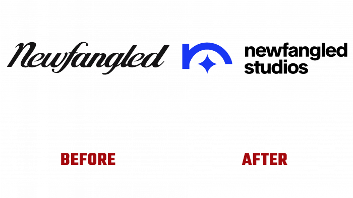
The creative agency Newfangled Studios, based in BOSTON, was updated in the summer of 2021. In partnership with Stephen Kelleher, the studio undertook a complete redesign of its corporate identity. As an LGBTQ and female-owned enterprise. It was Founded in 2009; the agency, during its existence, has already been able to establish itself as an enterprise that is not afraid to experiment, to create extraordinary projects. The brand is popular worldwide by creating various kinds of creative video applications. One of the most spectacular developments was the creation and design of the main scenes in Cannes. Today, the Newfangled Studios team is committed to providing flexibility and cost-effectiveness as additional factors in the established model of a large and significant advertising agency. Long-term partnerships with Bank of America, Google, and Staples also contribute.
The main element of the current rebranding is North Star, which has become the main reflection of the brand in its logo and overall visual identity. This idea was implemented in collaboration with Stephen Kelleher. This symbol has become a reflection of one of the most important directions of the studio – attracting the most creative individuals who know how to rationally apply their abilities. At the same time, the symbol also demonstrates the desire of the entire team to achieve high results, respect each partner, and contribute to the growth of both their own company and each partner.
To enhance the attractiveness and memorability of the logo, an original element of the logo was created – a modern interpretation of the letter “n,” which is located above the star, encompassing it with its semicircle. The linearity of the logo ensures the versatility of its placement in any version. Text placed to the right of the sign – the brand name is made in a sans-serif type Afical Neue Extra Bold by Formatype Foundry, characterized by rounded corners and uniformity of letters in the text. The absence of capital letters in it demonstrates the equivalence of each client for the brand, and the visual clarity of bold letters makes it easy to read in any version – print or digital.
The selected color palette also contributed to the visual reflection of semantic information, including contrasting black and white colors, accent saturated blue and soft pink. In a single composition, they create the required mood and reflect the main features of this representative of the advertising industry. The brand has taken on an exciting new look with this color scheme while demonstrating its commitment to equally immersive video creatives.


