In 1980, the Weston Park Cancer Charity in England was formed. Cancer research, assistance in improving technical support for diagnostics, promotion of cancer control and treatment services, assistance and support to families of patients – this is not a full range of foundation activities. The region has about 2 million people, where annually 10 thousand inhabitants, unfortunately, are diagnosed with diseases.
Directly Weston Park is a research and development center for cancer, where new ways to fight the disease are being clinically tested. In 2019, a charity based at the center launched a new logo designed by the local company Cafeteria.
Having passed the stage of selection of ideas, the analysis of impressions collected through a focus group of patients, stakeholders, medical personnel, the creators of the updated brand concluded that everything related to the activities of the charitable foundation is incredibly interconnected. Human relations, incredible support, ornate processes, and all sorts of nuances within the framework of the organization’s activities that they wanted to show in the new logo are a symbolic representation. Indeed, we found an ideological concept that would cover all these elements.
Thus, a purple loop, stylized as a naive child’s drawing, has become a generalizing image. It looks like a squiggle but with deep meanings and values.
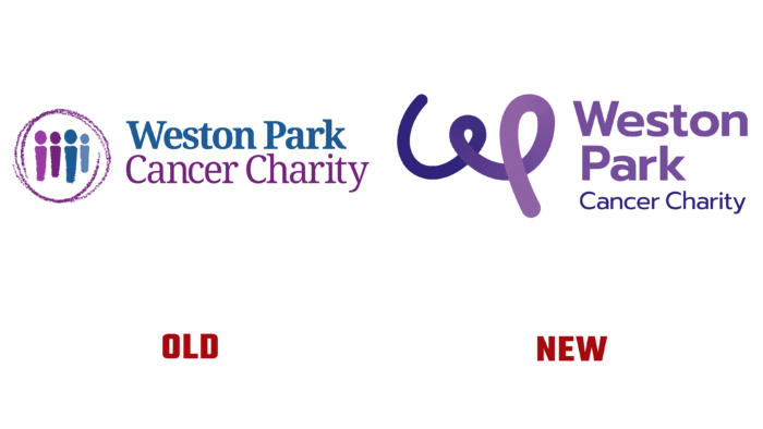
Uniting for help, support, involvement, caring, empathy… This list of values goes on and on. An excellent corporate motive, parts of which have been transferred to advertising posts, banners, social networks. The gradient is from dark blue to purple in the stretch, and the stylization of the letter W is in harmony with the name of the center and the profile of the charitable foundation. The verbal emblem is typed in Prompt; it complements the monogram with rationality, making the logo effective and unforgettable against what it used to be. The previous logo was also successful (in the circle, there are four symbolic figures of a person in different tones of blue and purple). Still, if it were not for the inscription that this is a fund for helping cancer patients, one could imagine another organization’s specialization.
The style of the lines of the loop itself continues a series of typical illustrations for various publications, which successfully creates a mood of optimism, good spirits, energy, and victory.


