The German Cyber Security Organization (DCSO) announced a redesign and style change for the company. As one of the most famous companies in Europe for the development and promotion of tools and tools for information security, DCSO decided on the need for rebranding, which is urgent in today’s conditions. Information security is one of the important areas for the successful development of any business. Its effectiveness directly depends on the quality and novelty of the means used for this purpose. DCSO follows this rule at all times. And today’s cardinal changes in the field of developed and provided security technologies and their maintenance required the mandatory informing about this potential customer of the company, consumers of its updated products in the field of cybersecurity.
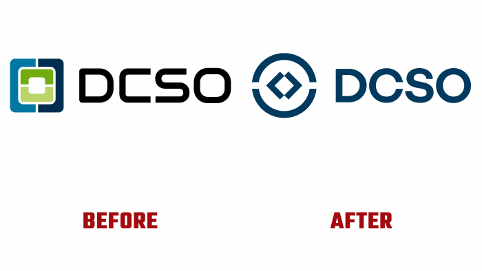
Changes in the appearance, the company logo to a clearer and more strategically grounded design were supposed to be a demonstration of cardinal changes, both in the field of updated technologies that ensure an increased level of product safety and in their service. DCSO ensures that the security tools are as effective as possible for each customer, working closely with him during all stages of development. With the help of a new visual identity, the company tried to convey its benefits to the consumer.
The leading German design agency Helder has successfully coped with this task, having established itself as an experienced strategic and creative partner in developing and creating the ideal image of modern and future brands in digital communications.
A dome-shaped sign was chosen as the key element, symbolizing effective protection. It became the unifying element of the entire composition and the basis of the new logo. The originality of this solution lies in the fact that, upon closer examination of the dome contour in dynamic digital advertising, one can notice its many small elements that at the same time symbolize the essence of the virtual space in which the protection of DCSO product users, both present and future, is carried out. The logo sign and text – the abbreviation of the company name, are made in Space Blue. The sign is an image of two domes, placed mirrored with a small gap on the sides. Inside, there are two single quotes in the center, forming a white square in the center, placed on one of the vertices.


