In addition to a bright logo, the designers chose a color palette, tone-of-voice, and worked on the positioning.
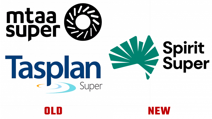
Spirit Super is an Australian fund with over $ 23 billion in assets and 338,000 members nationwide. The organization results from a merger between the MTAA Superfund for the automotive industry and Tasplan, a large Tasmanian fund.
The merger process ended in early April, and the designers at Hulsbosch created a visual identity to increase the organization’s visibility. Spirit Super wants to attract new members and retain existing members through new positioning. The designers at Hulsbosch were inspired by Australia and the main themes to come up with the right solutions and images for the fund.
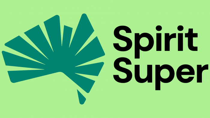
The Spirit Super logo is presented as a map of Australia as a continent. From the center of the image to the edges, broad lines appear that resemble rays. The laconic logo is shrouded in optimism and joy. Designers focused on bright, happy people who give smiles and enjoy life. The warm color palette of the fund consists of green and gold. All images, posters, and typography make people feel happy and inspired by the vibrant colors of Spirit Super.
Fund CEO Leeanne Turner says the organization is ready to move forward and claim to be the market leader. Spirit Super will easily convey freshness, optimism, and innovation with a new visual identity – what is so important to the fund. The organization’s logo reflects the company’s goal of making everyone in Australia special.


