Founded in 2001, the Palisades Parks Conservancy supports and raises funds for a network of parks and historic sites across New York and New Jersey. Recently, the organization introduced a new brand identity to reflect better its mission of preserving and promoting the area’s unique history and biodiversity.
The centerpiece of the new brand identity is the pitch pine cone symbol. Chosen for its resilience and significance in the local ecosystem, the pine cone represents the cycle of growth and support within the forest, providing food for wildlife and contributing to forest regeneration. This new symbol aims to communicate the conservancy’s role in protecting natural habitats.
Along with the central icon, the redesign includes specific logos for each of the 21 parks and eight historic sites managed by the conservancy. This ensures that while each site retains its character, all are unified under the broader conservancy brand. This approach highlights the distinct features of each location while maintaining a cohesive identity.
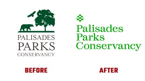
The new primary logo marks a significant departure from the previous design. The old logo featured a small tree overshadowed by larger animals, which could be mistaken for a zoo rather than a network of parks. The wordmark used different type sizes that made “PARKS” overly dominant. The new logo addresses these issues using the Esperanza typeface at a consistent size for the entire name “Palisades Parks Conservancy,” creating a more balanced and legible look.
The design simplicity of the new pine cone icon ensures that it complements rather than competes with the wordmark. This icon is effective at various sizes, with rounded corners and precise curves that make it visually appealing up close and from a distance.
The brand’s refreshed visual identity extends to its color palette, inspired by the changing seasons. This palette is used across different materials and events, helping to tell the conservancy’s story. A primary green shade emphasizes the organization’s environmental focus, while additional natural colors provide variety without overwhelming the main message.
The branding materials are enhanced with texture through a stencil version of the Esperanza typeface, enhancing the overall design while focusing on simplicity and clarity.


