The design was developed by the creative studio SomeOne.
Most of the Belgravia area is owned by Grosvenor Estates and Mayfair. After conducting research, SomeOne found that most newcomers believe the area is too expensive and do not visit local establishments. But in fact, all these prejudices have long become outdated, and now Belgravia consists of many restaurants where you can stay, as well as beautiful and attractive places.
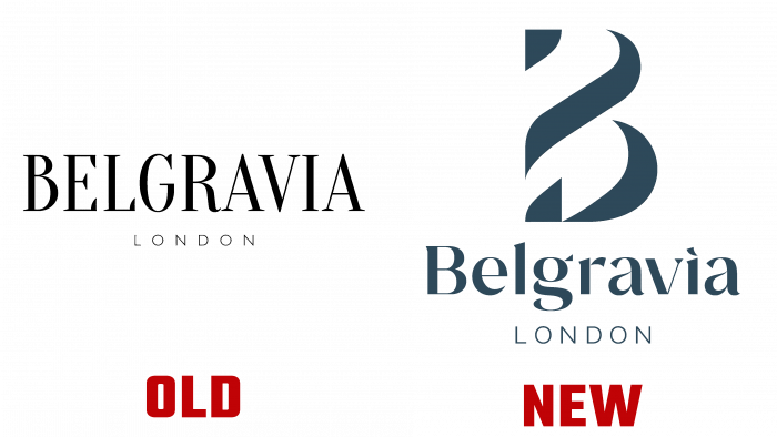
To completely change the perception of the area, the SomeOne team has developed a design system that shows the area from its best sides. The logo consists of a stylized letter “B.” The letter resembles a column that is often found on the buildings of Belgravia. The detail has become the center of visual identity.
A beautiful font complements the sophisticated and minimal design. Each letter conveys the uniqueness of the area, and the typography itself is sans-serif but with crisp, straight lines. SomeOne added colorful images to the overall picture. The atmosphere of the area and beautiful architecture are reflected in the design.
