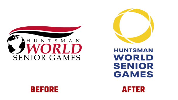
In 1987, Daisy and John H. Morgan, Jr. founded the original adult gaming resource Huntsman World Senior Games. Its structure was based on the founders’ vision of international sports events for men and women over 55 years of age. It was based on the understanding that the golden years are when good health and fitness move from a casual hobby to a lifestyle. In 1989, Huntsman became the general sponsor of the games, demonstrating their economic viability and impact on Utah’s economy. Since its inception, the brand has evolved while expanding the conditions and opportunities for games, reducing the age limit to 50 years. In this way, the organizers sought to attract even more people at the expense of those who were on the border of retirement age. Over the past few years, there has been a question of some reorganization of the structure and branding. Everything was prepared for the thirty-fifth anniversary when the founders decided to pay tribute to the long history of the enterprise.
A completely new symbol was created to look confidently and pragmatically into the future, and the font type was completely replaced. The new visualization carried the company into the next decade, allowing it to stand the test of time with confidence. First of all, special attention was paid to creating a new attractive color palette. The main color was bright yellow. It symbolizes boundless energy, eternal optimism, triumphant joy, and eternal friendship. At the same time, the sign sends the viewer to the features of the region in which the city of St. George, Utah, USA. This region is characterized by 255 days of abundant sunshine. Blue was chosen as the second color – a symbol of trust and stability associated with the enduring characteristics of the Games; at the same time, it is a reflection of the world of one of the founding principles and the entire organization.
The generated symbol is a combination of several geometric elements. Inside it are three lines intersecting at several points. Each of them is a fundamental principle and mission of the World Games. They characterize peace, health, and friendship. All this pays tribute to the founder himself. The next element is a circle, or rather an oval, representing the global participation of athletes from all over the world. Its closedness is a unity of spirit and purpose and a universal symbol of demonstrating the eternity, stability, and longevity of the Games. Created at the intersection, at the very heart of the symbol, an outline resembling a triangle refers to the brand, the logo of the 1987 games. Combining all these elements, the logo forms a bold symbol that reflects movement, energy, action, and unity.


