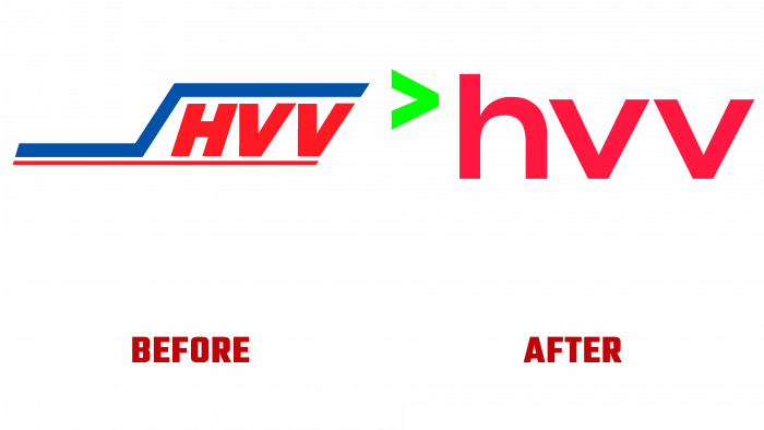
In 1965, 3 federal states, seven counties, and 25 transport companies in the Hamburger area were merged into the “HVV.” The largest number of passengers carried by the company was in 2019 and amounted to 784.5 million. But the pandemic has made its adjustments, and the number transported by trains, buses, and ferries has dropped significantly. This situation required a change in the overall strategy and self-esteem of the brand. First of all, the changes concerned visual identity, which was required to accurately convey the improvements in mobility and solutions to the problems of preserving the climate.
The new visualization allows the continual tweak in the future using better conditions, an analytical approach that correctly assesses people’s needs. One of the important tasks of the future is to organize the supply of public transport within 5 minutes. A changed self-image implies a complete change in external parameters, color palette, and logo, including the association itself. Today, the company is leading the statement, “What are you worried about?” Which expresses the priority of customer focus. Mobility, comfort, simplicity, and ease of perception of modes of travel are priorities for the Hamburger Verkehrsverbund. The association strives to create the most efficient conditions for its passengers, reflected in the new brand identity.
The current rebranding took place for the first time in 20 years. An important change in appearance was the color palette, which expanded significantly. In addition to the traditional corporate shades – red and blue, the company’s color scheme uses green. All colors are more saturated and brighter. The accent element of the logo was defined by the mathematical sign “greater than,” executed in red. It is adopted as a profile mark used as an element of recognition in social networks. To the right of it is a monogram of the first three letters that make up the association’s name. The monogram is in bright red. Capital letters, even sans serifs.
The rebranding demonstrates the formation of a new beginning. It differs from the previous version in color, energy, youth, and modernity. Fresh colors, bold, clearly defined font, ensuring ease of reading at any scale, conciseness – all this, and the originality of the pictogram, had an important influence on the formation of the image. The logo has gained flexibility in perception and ease of memorization. The green color symbolizes movement and tasks related to solving environmental problems, using the latest transport technologies effectively.


