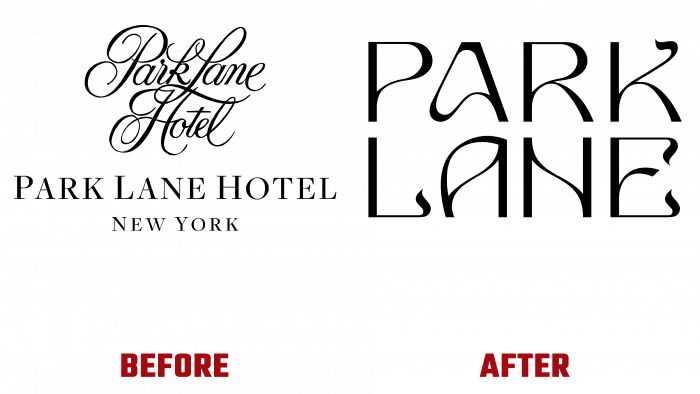
Located in one of the most remarkable and beautiful places in New York – Central Park, the luxurious Park Lane hotel appeared to visitors after its completion. In this regard, the New York-based company Mother Design carried out fundamental changes in its visualization in full accordance with the new style. The hotel was built in 1971 according to the project of the family company Emery Roth & Sons.
The reconstruction of the building was the monotony of the style solutions of the buildings, which surrounded Park Lane. Despite neighboring architectural objects’ historical and cultural significance, their traditional luxury has ceased to be an attractive advantage over the years. The hotel building, created in compliance with the design community, harmoniously blended into this environment but lost individuality. The abandonment of the outdated, conservative, unpromising luxury in its isolation made it possible to change the situation radically.
The hotel’s rich history, unique location, and completely revamped interior design inspire the brand’s new logo and graphic name. A vibrant color palette has been used that changes with the park’s nature according to the seasons and eclecticism of unique textures. With the help of this, an understanding of accessibility and even some playfulness was formed, the perception of the hotel as a living being was ensured. The font of the name, in the Art Nouveau style, was influenced by the special architecture of the hotel, as well as the natural beauty of the parkland in which it is located. The wandering paths of the park were reflected in the winding lines of letters that form patterns unique in their beauty and whimsicality. Under certain conditions of the use of the logo, these patterns can be regarded as the richness of the interweaving of the antennae of living plants. To create an attractive contrast and link to the hotel’s architectural elements, the letters are drawn using straight lines, whose composition echoes the decoration of the façade. In this way, a visual connection was provided between the surrounding nature and the architectural features of the object.
The use of the text of the title in digital and print formats provided for the possibility of using only certain parts of it and moving words relative to each other. The graphics of the font were designed so that the logo could be interpreted in a language that uses the shapes of the window cartouche. In this way, all the interweaving of patterns and lettering elements made it possible to convey the romance of nature and the sublime, poetic, somewhat mystical history of the hotel, which began to attract the attention of travelers residents.


