Dario Suter, Christoph Daniel, and Marc Schmidheiny founded the large film company DCM in 2008. Joel Brandeis joined them in 2010, but the brand name remained unchanged. The company quickly established relations with partners, consolidating its position in the film industry market; after seven years, Berlin expanded to Switzerland. Providing strategic, technical support to young companies, DCM became a brand whose activities were based on three pillars – film production, distribution of film products, and investing in startups. Thus, the brand combined films, technology, and media in its specialization, which could not affect the growth of its popularity.
The creative group MADE from Zurich made a rebranding, and now the logo looks more cheerful and interesting. In a new way, it is emphasized that the company, created by three young and courageous people, has gained prestige among competitors and is changing the surrounding reality with enviable constancy. Unique collaborations, immersion in the cinema world, expression of your charisma – all this is in the new logo.
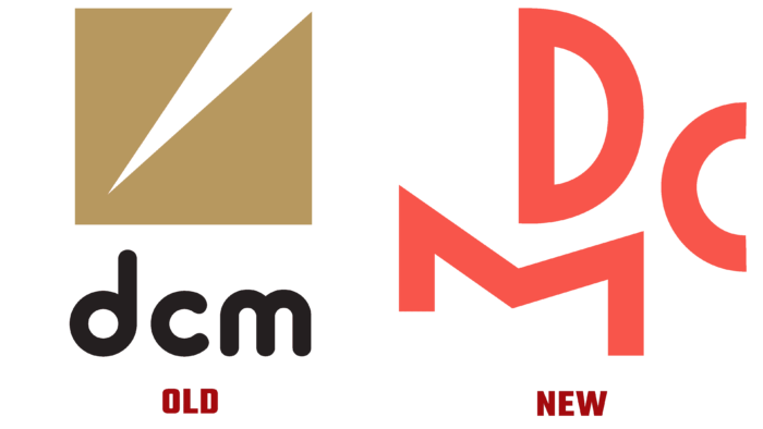
Previously, the logo had an image of a strange brownish-yellow square with the tip of a nib or other writing sharp object cutting into it. The contrasting element was the font, which depicted three letters – too soft, rounded, and even black—with no association with the film industry or a hint of the company’s striking essence.
On the contrary, bright coral letters of different sizes are jumping with each other as if in a creative victory dance. The letter M supports D, pointing at C with an angle. As if these are three friends who come up with something and help each other. This logo is organic, logical, and pleasing to the eye.
Looking more closely at the logo, you can see that all three letters are connected like elements of an old movie camera. Such a creative solution can delight not only connoisseurs of symbolism in design but also fans of the film industry.


