New Zealand beekeeping pioneer Bryce Hooton from the East Cape decided to implement his idea of educating the world about the unique properties of real, local honey – manuka. A landmark meeting with Mike Bell was the beginning of the formation of a joint business, which led to the creation in 1998 of a company for the production and sale of honey – Manukora. Falling in love with Bryce’s philosophy of protecting the planet, including the bees during their honey production, Mike got his entire family involved in the idea. Using his unrivaled experience in food production, he brought Bryce Hooton’s honey-making technology into the business, putting it on a grand scale. In just a few years, using Mike’s innovations and acquired skills, he has expanded a specialized facility for processing this “liquid gold,” creating high-quality manuka honey under all conditions to be able to sell it worldwide. Concern for the environment, bees, beekeepers, landowners and staff, suppliers, and customers became the basis for forming an updated brand. With the mission of helping create a healthier and better world, the company has made it an important focus in its new identity.
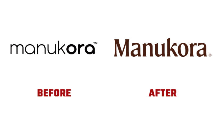
A rethinking of brand goals and objectives and current image trends and technology demands has led to a rebranding recently introduced to consumers. Based on historically shaped visual elements, the company has made specific changes to the logo’s look. Leaving its composition as a performance of a word mark – the brand name, the designers used the original sans-serif typeface, characterized by conciseness but the clarity of each letter. The original font type Moret Semibold by The Northern Block was taken as the base. The letter “a” was redesigned, whose upper part provided a more harmonious perception of the entire verbal composition. The simplicity and lightness of the forms made the logo easy to read and remember. The contrasting black color has opened up wide possibilities for placing the logo in various combinations, making it stand out against the background of other image signs.
The minimalist style and the very composition of the various elements of the identity received spectacular support in the form of vivid illustrations and photographs of wildlife, characteristics of New Zealand, and important moments from the history of the brand. Particular attention was paid to the packaging. A kind of separation by honey grades was applied with the help of a variety of colors, formed using contrasting combinations of dark tones, silver, and gold. The packaging itself is original and attractive. For ease of use, it is designed for each type of product and the appropriate dosage.


