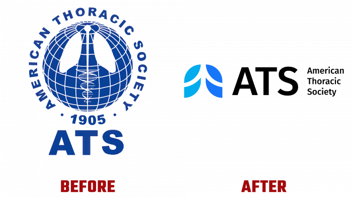
Created 116 years ago, the American Thoracic Society (ATS) has constantly kept pace with the times, applying innovations and the latest advances in medicine. The company marked its development by changes in its visualization, logo, accompanying information about itself. Modern technologies have opened up new opportunities in presenting information, placing strict requirements on any brand to ensure further success. Today, the American Thoracic Society, headquartered in New York, has opened a new chapter in its more than a century of history. On September 7, 2021, ATS completed the largest rebranding in its entire history, presenting itself to its patients and users of its services in a completely new form.
Changes in the company’s visual identity covered almost all aspects related to advertising and information support – emblem, logo, corporate identity, website, and all types of image and information products.
First of all, the logo underwent reconstruction, which acquired a more effective design on a visual level. The slogan has also changed, declaring the mission of ATS, its importance, and focus. The logo has acquired not only a modern visual identity of the professional direction of the company. It provided a visual sense of the company’s energy, aimed at preserving patients’ health, saving their lives. At the same time, it has become an important element of a unified visualization, which focuses on strengthening cooperation with specialists in the field of respiratory diseases of all types, covering all types of research, preventive measures, and treatment in the unity of its content methods.
Visually, the logo has been greatly simplified to make it easier to read. The stylized image of the lungs in two shades of blue – symbolizes air and breathing, on which a person’s life directly depends. The sign is followed by the abbreviation of the Society – ATS. Made in monochrome black in large lowercase letters; it is easily and perceived on any surface in combination with images or when executed on-site pages in digital media. Next to it, in a “column” is the decoding of the abbreviation, aligned to the left and having restrictions on the height of the letters of the abbreviation.
All this “works” to inform patients about the company’s constant improvement of conditions for improving their health. In addition, the new image emphasizes the unity of the Society’s staff in striving for this goal and opportunities for training, continuous professional development, and career advancement.
ATS update – increases transparency and understanding of operational specifics. A demonstration of the use of innovative technologies is provided that simplifies the interaction between departments and members of the Society, reducing the time for decision-making and creating the most effective conditions for treatment.


