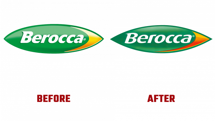
Founded in 1969 as a vitamin supplement developer, Berroca, a German corporation brand, has unveiled a redesign of its logo from Free The Birds. The new logo and packaging already accompany the brand’s products in effervescent drinks and vitamins in pharmacies and supermarkets. The design change took place due to the low efficiency of the visual impact of the previous version on the consumer. The main direction of the rebranding was the visualization of the company’s important message – The Spark to Positive Energy, which is mentioned on all the brand’s image and advertising products and product packaging.
The primary symbol that resembles a bullet through the creative efforts of the designers of the creative agency has been transformed into a modern graphic element, suggestive of quality and high reliability. This option best provides brand memorability and is easy to read both on the packaging and digitally. Accordingly, it raises the entire Berroca product line to a higher level, attracting more attention than similar products on the shelves. The graphic image of an explosion, an energy release, a flash, placed together with the logo, has significantly increased the visual impact on the buyer, emphasizing its importance for maintaining health.
The new style also included a changed color palette. The choice of colors – yellow, orange, light, and dark shades of green, black, and silver- create a bright, attractive color composition and play another important role. Each color is responsible for a specific range – Energy, and Boost, improving navigation through different types of proposals to their impact. This is especially true for lollipops with a wide range of flavor characteristics. Each taste has its color.
The packaging uses modern imaging technologies – unique illustrations have become a spectacular demonstration of the benefits of Berroca products, including the key fizzy drink.
An important aspect of the designers’ work was the harmonious visual integration of the brand’s history and modern changes. This was facilitated by design common to all types of the company’s products, built around the composition’s accent element – a positive charge of energy. With the help of a creative approach, Free The Birds managed to create an update that provided the required visual impact not only on the category of people who are especially sensitive to their health but also to expand interest in their offer to all other groups of buyers.


