Launched in 2020, Bright Barley’s line of nutritious barley cocktails is an age-old recipe for a potent alternative to milk. Its manufacturer – Jiali Jiang, a native of Tibet, now living in the UK, who has been restoring the ancient formula of the drink for six years, presented a new visual identity of its product at the end of September 2021. Bright Barley Barley Shake was created for those who prefer a vegan lifestyle and enjoy coffee with milk from this product to include a chocolate mixture of salted caramel in their diet. In the original version, such products necessarily contain animal milk. Now, these unique flavors are available to all vegans in the world. Since its appearance on the market, the novelty has already won the appreciation of many UK vegans. The study of consumer demand and feedback on the convenience of visual selection of a cocktail provided great assistance in forming the corporate identity, logo, and packaging design. The design company Leeds, UK-based ALLGOOD, was entrusted to put the obtained data into practice.
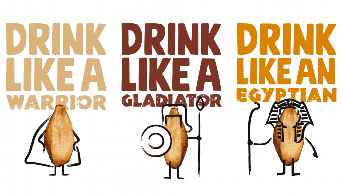
The solution proposed by the designers turned out to be not only original but also quite effective. The appearance of a “live” cartoonish and cheerful character – a grain of barley not only helped to reflect the characteristics and benefits of the drink. The brand has acquired a unique appeal, becoming easy to remember and vividly distinguishing itself from other types of vegan products. The text logo itself is not particularly original. Still, it is quite practical and successfully conveys the required information about the product’s naturalness, its plant composition, as evidenced by the spikelet of barley, which stands out clearly against the background of black text. The font – Mindset ™ by PintassilgoPrints was individually designed.
The text began to look very impressive after creating the visual impression that each letter was applied by hand. This is especially true for repeated letters “B” and “R.” Bold letters, high density of their placement about each other in both words, and a light yellow spikelet between the second and third letters of the first word created a readable and memorable composition. At the same time, the rays emanating from the spikelet, dynamic in digital design, create a favorable illumination effect with the help of all the elements of the logo, which attracts even more attention to the composition.
It was given and a symbolic tribute to the history of human use of barley in the form of the number of years of its use in the form of text – EST. 10,000BC on various image and advertising printed and digital elements. To reinforce the connection between such an ancient nutrient-rich ingredient and its modern application, the original slogan was developed and used: OLD GRAIN – NEW TRICKS.


