Sport is the area of design where everything should be bright, dynamic, not boring, and energetic. Nobody will make an identity with elements that cause melancholy, negativity, excessive aggression. To show strength, sometimes, they use interesting images of lions, rhinos, and eagles with powerful energy, but this is all balanced, harmonious, and, accordingly, the situation of use.
This year the logo of the 2023 International Ice Hockey Federation (IIHF) World Championship was presented. The organizers do not give up and continue to support the preparatory projects for the men’s tournament in St. Petersburg.
Together with officials of the Russian Ice Hockey Representation (FHR), the outgoing president of the federation, René Fasel, attended the logo presentation event at the Grand Hotel in St. Petersburg. He was also attended by such famous persons of Russian sports as FHR President Vladislav Tretyak, Vice President of Roman Rotenberg, and Pavel Bure, FHR representative for international affairs. Pavel Bure, an outstanding athlete for whom almost all life is hockey, now in a leadership position, notes that the upcoming tournament is not just a sporting event but a whole cultural holiday that will leave a colossal mark on the history of Russian sports.
Two areas were chosen as the base for the tournament, one of which is the Ice Palace, in which 16 teams will fight. The second arena is still at the stage of construction work. It is located on the territory of the Peterburgsky sports complex, designed for an audience of more than 20 thousand spectators. Construction is expected to be fully completed by the end of 2022. As soon as the arena goes into use, technical matches will be held to test the new venue for the upcoming championship fully.
St. Petersburg will already host three foreign guests at the championship. Together with Moscow, this tournament was held in 2000 and 2016.
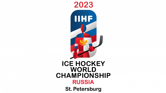
As for the event logo, here’s how things are. Firstly, it is interesting that the concept was borrowed from the world-famous Russian artist Kazimir Malevich. His painting “Sportsmen” is made in the style of Suprematism. In the abstract art of the twentieth century, this was one of the most influential trends, which was reflected in the work of many masters.
The hockey player against the background of a rectangle with rounded ends became the emblem-logo of the new event. At the very top, the numbers are written separately – 2023, the sporting event year. The name of the federation in English letters is displayed over the head of the hockey player.
The background resembles the flag of Russia, as well as the main colors in the athlete’s clothing. He holds a gray club in his right hand, and on the form a two-headed eagle, the national symbol of Russia. There is a registered trademark mark. The name itself is highlighted in black – all with capital letters: ICE HOCKEY WORLD CHAMPIONSHIP. And below – RUSSIA in red.
A very interesting avant-garde logo made in a special style and does not resemble other logos. The darkened sides of the hockey player’s ammunition, his head, look beautiful. He is divided into zones, as the tradition of Suprematism dictates. It is also a tribute to the art of the past century, respect for history, and a confident look into the future.
This unites people from all over the world, puzzle pieces, sides of one whole. And at the same time unique, creative, collected in one place.
Actually, like the hockey teams in the future championship. Therefore, it will be interesting to see how athletes from different countries perform under such a logo.


