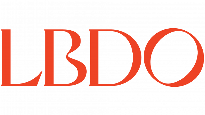
Founded in 2020, the Australian digital brand LBDO was created to provide intimate health care. The proposals presented on the site are only separate proposals, the effectiveness of which can be fully disclosed only in combination with the appropriate techniques recommended by professionals in this field. The creation of an interactive platform was based on such important psychological concepts as openness, comfort, and safety. Even the name itself provides a double reading, which allows you to choose the pronunciation option according to your understanding of the openness of your pleasures and intimate problems.
LBDO owners turned to the renowned Australian design agency Universal Favorite from New South Wales to popularize the offerings and the brand itself. Designers have carried out effective work to reduce the negative attitude of others to enterprises from this segment, the destruction of taboos and labels. The brand’s required visual and verbal perception was ensured due to the beauty and neutrality of the presentation of the information. The approach provided an opportunity for a respectful and open conversation on intimate topics, revealing the methods of promoting sexual well-being. For this, a convenient connection was organized on the website with a guide-psychologist of the company, who, in a very polite, accurate, and respectful manner, could provide verbal assistance to those who were thirsty in choosing what they needed, advising on the features and methods of using the products.
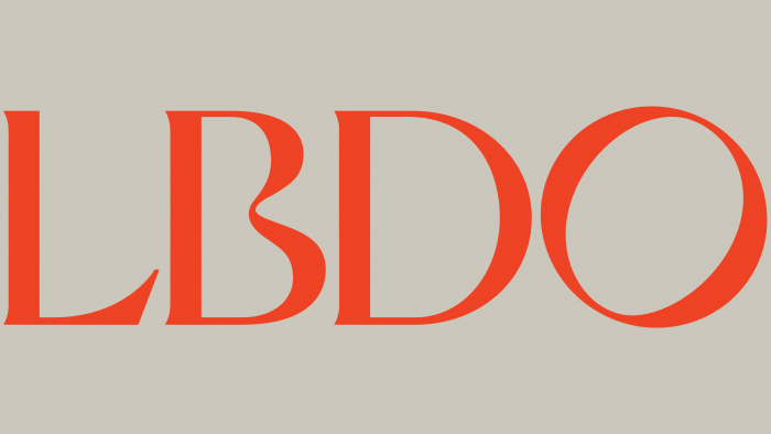
In terms of color, it was decided to move away from the typical for such sites of bright colors, “streets of red lights.” A coffee-chocolate delicate, aristocratic and elegant style with a soft light red backlighting was chosen. All design elements received smooth curves, visual softness, and silkiness, characteristic of the outlines of the female body and tactile sensations from touching it. This version turned out to be even more erotic but in its high sensitivity, characteristic of real art.
This effect was also supported by choice of a pair of fonts like Ivy Presto and Neue Haas Grotesk against a background of soft sandy and grays. Its thin serifs and curves of the letter “B” ensured unity and harmony with the overall corporate identity. The minimalism and simplicity of the logo and the particular approach to the formation of the name itself made it memorable, creating the required perception of its true meaning. This is prompted by the graphic solution of the letter “B” and the emerging visual interval between it and the “L,” hinting at the missing letter of the word. However, the slope “O” raises some doubts about the correct understanding of the interpretation of what the designers wanted to express. All the typography of the site, the use of fonts, and the logo in the interactive modules were built on several ways of reflecting movement and active life while creating a feeling of fluidity and sensuality.


