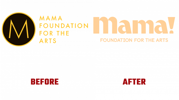
Founded by Vy Higginsen over 20 years ago, the Mama Foundation for the Arts is in the best traditions of Harlem (New York) and is a youth cultural community. The fund’s recent rebranding provided a new visualization and well-deserved attention to its purpose. Among the tasks that the foundation successfully solves, the most important are – providing opportunities for people of all ages to get access to quality training, followed by free employment by artists and performers. Considering the need to keep up with the times when the requirement to preserve the historical and cultural heritage is so important for the fund, the task of changing the visual image was entrusted to professionals from the ThoughtMatter agency.
The result of this cooperation was a deep rethinking of their own identity. The agency’s designers’ creative approach and extraordinary thinking made it possible to form a new style, which has become a tool that will bring inspiration to a whole generation of future artists. The beginning of the work was built on close cooperation with each of the community members and those interested in its prosperity. This made it possible to receive a charge of the necessary energy to create a unique individuality and to feel every element, every link of the future mosaic of a new identity. Two important elements have become symbols: an arched window and an exclamation mark in the logo text.
Arched windows offer a view of the group’s history, achievements, and joy. At the same time, they symbolize the windows of the houses of Harlem, from behind which the sounds of the holiday created by the brand can be heard every morning. They have become an integral part of the visualized style of the community, appearing on all site images, image products, and advertisements.
Another main direction was the realization of the reflection of that unique joy that entails the correct projection of their voice and body by each participant of the Mama Foundation for the Arts events at the time of performances. This symbol is the exclamation mark placed after the first word of the brand name. For the text sign, ThoughtMatter designed a custom typeface inspired by the arched shapes of the windows. This method became a symbolic promise to convey the required information to everyone and make the group’s idea seen and heard by everyone.
A bright amber was chosen as the color scheme of the font, carrying positive and joy, which are conveyed by each song from the Mama Foundation. In addition, such a color effectively harmonizes with any image, both digital and printed, standing out in contrast against any background.


