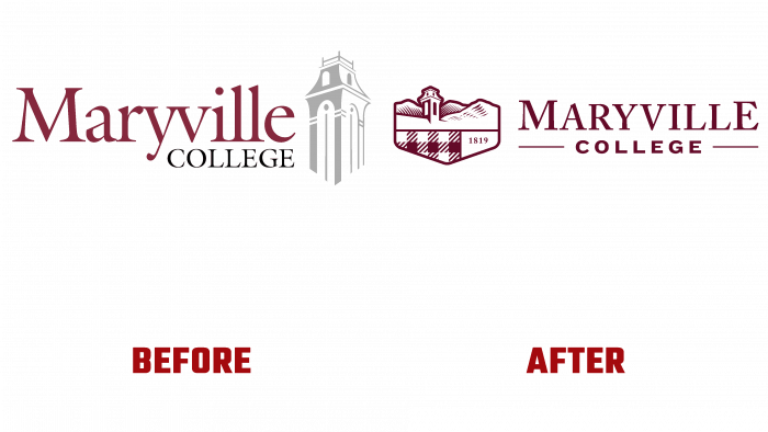
For a while, advertising and design agency Visual Voice helped reimagine the identity of Maryville College. This institution has been using the old logo for a long time; since 2002, they have been using the styling of the Anderson Hall bell tower.
The famous bell tower has been the leitmotif of the visual identification of the college for a long time; they do not want to abandon or modernize the logo because this image is recognizable and is a direct association with the place.
College President Dr. Bryan F. Coker explained that the new identity reflects a strategic vector that was defined a year earlier. The idea was to present the familiar local landscape and designate it in a new way, namely by incorporating it into the visual appearance of the educational institution. It will play a differentiating role in a competitive and active higher education environment, point to the location, and enhance civic pride in the region.
The President also noted the special fact that such unique, beautiful places admired by the residents of the region and college students can rarely be found anywhere. The amazing view of the National Park in the backyard, a historical site, is already a reason to be proud. Such luck of the geographical location will help build a certain identification line for students, partners, and sponsors.
The creative working group consisted of 12 people, which included teachers, staff, students, and graduates. We worked in the spring and summer, and as it should be for solving such important tasks, we first carried out all the necessary processes for the analysis and collection of information, then created the logo itself and its modifications.
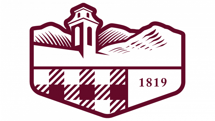
The logo system includes several important aspects. This is the geography represented by the “three sisters” – the mountain peaks of the Chilhowee Mountain Range, which in turn occupies a huge part of the Great Smoky Mountain National Park. This is the background of the campus.
There is also a version in which the college was founded in 1819 and a symbolic image of a plaid shirt. Why such a pattern? For the answer, you need to look to Maryville College’s Scottish-Irish roots. This pattern is the hallmark of the college. It has been used as an identity element since 2019.
When viewed as a crest, it is a tribute to the college’s ancestors, history, tradition, and reputation. The content and form of education, the excellent organization of all methodological processes, and attention to students – this is what makes the college one of the leaders in youth elections by the standards of the region and not only. Focus groups, assembled from students, emphasized that orange and garnet shades should be adhered to in developing identity.
That is why the family of logos, designed by young professionals, looks so varied and colorful. At the same time, there is no need to prove that this logo design style is outdated. It is very rare when a logo looks conservative and fashionable, according to the current time, and reflects the target audience’s interests.
In general, the logo reserves the choice – in the form of a coat of arms, vertical rectangular with the beauty of places, just abbreviated letters MC against the background of the tower and mountains, and even a variant without any inscriptions. Diversity will not be a hindrance but, on the contrary, gives prospects for expanding the scope of application.
Undoubtedly, such a play of colors, smoothness, and sharpness of outlines gives great contrast and gives the observer a pleasant feeling of warmth and care for history, people, surrounding nature, and traditions.


