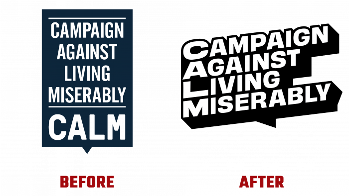
In 2006, the UK charity Campaign Against Living Miserably (CALM) was founded and changed its visual identity. Its task is to provide effective assistance for suicidal tendencies. CALM has established a free, confidential telephone line for people on the verge of taking their own lives, carries out suicide prevention and public awareness activities, raises funds to assist in critical situations, and supports companies reporting on the issue. The company is the initiator of creating a community where everyone can share their experience, problems in this area and receive the necessary assistance. In September 2021, the company unveiled its new logo created by design agency Studio Output.
The peculiarities of the company’s work and the contingent of customers required the creation of a system that would include a visual reflection of the essence of the brand and provide verbal identification. Moreover, it required flexibility to cover all the nuances and features of the company. The new logo is less informative in terms of the amount of text. But graphic design opens up wide possibilities for its application combined with a wide variety of materials when used both on digital and print media. It has four lines of text made up of the words of the full brand name, right-aligned. A black shadow frames white letters to create volume, effectively highlighting the text in animations. Each first letter is made in an enlarged lowercase, which, when read from above, allows you to get an abbreviation of the name.
Creating an individual identity was based on three main characteristics of a brand – optimism, sensitivity, and some audacity. They are symbolized by three colors selected for each characteristic. Depending on the brand’s actions, each of these shades can become brighter or more subdued, creating the optimal atmosphere for encouraging people to open up. Their reflection was carried out in the general context of cardinal changes in visual identity. The logo has become a bold statement of purpose, objectives of CALM, its mission. The style of the text helped to achieve the desired perception. Graphics and text information expands the semantic load, which is conveyed visually. Together, such presentation and design language, easily perceived visually, make the logo flexible enough while maintaining unity and general cohesion.


