Colombian breweries are currently in the midst of a COVID crisis. Even though there are no restrictions on its production, as in Mexico, the country has seen a sharp decline in the production of a local product. Against this backdrop, the launch of the new Cerveza Guardian brewery in 2021 has become a significant event for local craft beer lovers. Being a newcomer to this market, the company immediately tried to declare itself not only by the original taste. The unique formula derived from research and the creative work of the Invade design studio (Medellín, Colombia) became the foundation that allowed the brand to establish itself in the Colombian market immediately.
To effectively promote Cerveza Guardian, the logo reflected two main concepts of success – science and art. Despite its somewhat opposite, their combination in a new emblem successfully solves the task. Knowledge and passion for creating something new and appealing have become the basis for creating a new Colombian craft beer that demonstrates a unique balance between science and art. The designers have successfully solved their task – to materialize this union in the new brand’s visual identity. This was helped by the use of a pair of hands, between which, in the internal free space, the appearance of a round neck is formed, the can covered by them, as well as the visually created outlines of the capital letter of the brand name – “G.” At the same time, the position of the hands creates a clear figurative impression that the person protects, protects not only the letter but also the product itself. While simultaneously demonstrating the thoroughness of human beer development, such a connection provided the required visual perception of the uniqueness of the proposed drink, strict adherence to its preparation recipe.
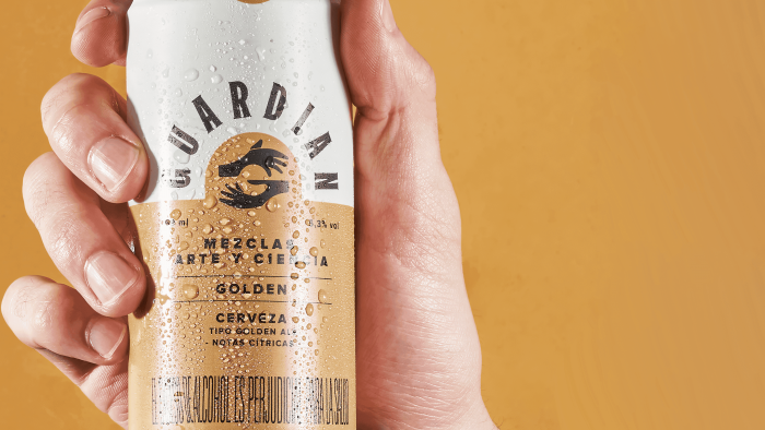
Placement of the brand name “Guardian” around the image of the hands, executed in lower case letters, creates the impression of diverging rays from an imaginary circle created by the hands. It looks especially impressive on a can, where two-color and different-polarity blocks are used – white and muted gold with accent black text and sign. The hands are in a golden circle. And from its border, the letters of the text radiate out, repeating the contours of the circle outside of it. The circle itself is perceived as an inverted “tongue” on the lid of the can, which enhances the symbolism of the entire image, its attachment to the essence and packaging of the product itself.


