The success and popularity of any company directly depend on the correctness of the visual presentation of the revised strategy and the internal changes that have taken place. This need to change its identity was felt by Paintclub, which is on the verge of great change. The branding agency FST (London, UK) was entrusted with redesigning its style and creating a new logo, which has established itself as a successful creative solution in the field of brand design. The task set required a reflection of the company’s new features in the context of a pandemic crisis, a massive turn of the world community towards the widespread use of digital technologies, their global expansion into all spheres of human life and activities.
Being a unique platform that opens up wide opportunities for everyone who loves and knows how to use a brush, Paintclub directs its efforts to enable everyone to reveal their talents, to spend their time with pleasure, both alone and in the company of friends and like-minded people. Due to the quarantine, real training programs were transferred to the online system, where online classes were formed according to the profile of the corresponding training. Company founder Aisling Kearney Burke turned to FST for help in redeveloping the company’s graphic symbol, style, and strategy.
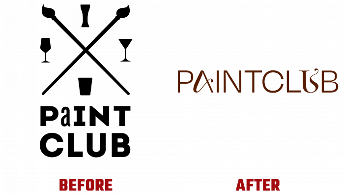
When developing the new concept and logo, the emphasis was placed on Paintclub as a creative business. The main direction in creating a new strategy was to popularize the company’s idea to increase the availability of art worldwide. The emphasis was placed on the graphic construction of various forms. In particular, a deep study of the logo took place, in which it was decided to abandon various elements, except for the text name of the company. In doing so, the elegant lowercase font has been redesigned in an artistic style to symbolize its direct connection to art. For this purpose, a clean sans-serif font was used with the addition of the original art style letters “A” and “U.” With their help, the atmosphere of liveliness was required for perception, and a demonstration of the flexibility of the brand is created. This opens up ample opportunities for his adaptation to different situations, moods, or a new image. The typeface creates a completely new look for the logo, giving the brand a strong personality and differentiating.
The color palette used in the formation of all image directions turns off five primary colors. They visually animate and provide dynamics to all advertising elements while not distracting from the accent masterpieces used to form the new brand image.


