Enzo Garofalo, a professional Team Canada Athlete triathlete, developed the new GUD protein drink by founding a company in Vancouver, BC. To increase the drink’s visual perception and understand its purpose, a new emblem of the product was developed, which is distinguished by high taste qualities against the background of an improved formula. Unlike the offerings of other manufacturers of protein drinks for athletes, whose taste is reminiscent of chalk, has an unpleasant taste, and even the smell of an old GUD shaker can be drunk with pleasure, at the same time refreshing and restoring. Its formula is a personal development of the company’s CEO, which includes 20 g of protein and a unique blend of electrolytes in calculated proportions of the composition. To improve the taste, a little maple syrup and black carrot juice are added to it. A natural product is used as a sweetener – stevia leaf extract. Such a composition provides more efficient and quick body recovery after the most difficult workouts, ensuring full compliance with the athlete’s dietary requirements.
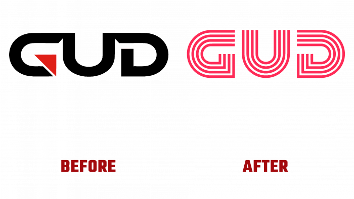
To convey all the product’s benefits to the direct consumer, it was decided to change the somewhat heavy and not very informative past logo of the drink. Since October 1, 2021, its new visual identity has appeared on all containers and packaging of the drink. Keeping the brand name, the designers partly moved away from the previous form of the graphic image. First of all, all letters were separated from each other by a space. The distance between them was visually verified to preserve their perception as a single text, but at the same time to allow distinguishing the features of each. Thanks to this, it became possible to apply an original visual solution – the letters “G” and “D” were made symmetrical in shape. In the inverted state, they acquire the meaning of their pair. The middle letter complicates the creation of absolute symmetry a little. However, the vertical arrangement of the symbols on the cans provides brand recognition in any container arrangement.
To make it easier to identify the purpose of the product, each letter has been formed by four red stripes with white spacers that repeat the shape of the letters. The lines are a symbolic representation of the tracks on the stadium’s cycle path. In this way, it is not only the information conveyed that the drink is intended for athletes but also a tribute to the professional affiliation of Enzo Garofalo – the developer of the drink. To enhance the product’s visibility, a stylized image of a closed stadium cycle track has been added to the packaging. It is made in the style of the inscription of the drink’s name, placed in the inner space of this symbol.
