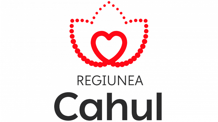
At the end of June, within the framework of the EU4Moldova: Key Regions program, the Regiunii Cahul brand presented a new logo, which first appeared to transfer a special vehicle to the disposal of household waste from the European Union.
One of the key points of the municipal program was to create a positive brand reputation in the eyes of citizens and business representatives. Thus, the design had to solve several problems: to inspire confidence in the region, to present the technological design of the region at a high level, to show closeness to the population, and to express commitment to the ideas put forward in the program.
In connection with such an important socio-economic event, a whole identity system was developed – a logo, individual image elements, a slogan, and a brand book were also added. The basic rules for the use of corporate identity were written. The motto of the region’s brand was also developed.
The head of the project team, Eugen Boico, noted that the brand should provide recognition and reflect the efforts to create the object itself. The brand will help to become more visible to the region, thus becoming a platform for business development and various communications.
The local design group Hora Design was involved in the development of the identity.
As for the logo, the idea consists of several elements, although in reality, the graphic solution looks quite simple:
- First, the concept is based on the heart. This is the soul of the region, its people, and the joyful events that the region is rich in.
- Secondly, it is a white water lily – a symbol of representation, authority, and solidity with which the district is associated.
- The source of life – the third symbol – means healing mineral waters, which the municipality of Cahul can be proud of.
On the whole, the logo looks simple at first glance. But it is very cordial and ideologically positive. It combines nature, people, and the environment in general—a very good option for showing the area in a modest but tasteful way.
The result is an interesting image. The intersecting lines form a red heart, which continues into a refined lily as if woven from a red thread. Small stitches, round dots add lightness to the image, which is beautiful visually and harmoniously combined with the life of Cahul itself.
The motto of the region has become a sincere expression. It falls into the very heart of the people for whom this area is native, their home and comfort.
The design team has also developed a series of models for the use of visual elements. This made it possible to make combinations with visual images for further cooperation with business representatives.
The logo design is unambiguously successful in all respects: idea, presentation, combination, and even color.
The red tint symbolizes activity, movement, passion. Therefore, it is not surprising that the active population, who cares about what is happening in their native land, will actively express their civic positions and represent their favorite region under the new logo.


