London-based furniture design and branding studio Run for the Hills introduced its clients and guests to its new online design service. Miscellany – this name was given to the sub-brand, gained its visual identity, the graphic design that can be found today on the website. With Miscellany’s help, the studio plans to improve the distribution of its product. Its use in conjunction with the Zoom application used by designers will significantly save time for feedback from their clients. Thanks to this, conditions arise that allow reducing the price of services.
The designers of the company themselves carried out the development of the corporate identity for the application under the direct guidance of the founder and director of the company – Chris Trotman. The desire to follow modern trends while maintaining the unified Brit Cool atmosphere adopted for Run for the Hills has ensured a unique style. Miscellany has acquired a distinct personality that allows it to be viewed as a separate component. At the same time, a definable visual community with its creator was preserved. The company’s design team developed the logo, appearance from scratch (using the Webflow tool, which experienced visual developer Daniel Drabik used from Buck Rabbit), website functionality, typography and sound effects, applied illustrations, and animations.
The name for the sub-brand was not chosen to attract attention. It reveals the secrets of creating magical spatial compositions by the company’s designers. Taking completely different elements to form the interior, the designers create a single and harmoniously designed space, combining everything into a single composition using unexpected and stylish ways. At the same time, the unique features of the design style chosen for the room’s decoration are observed.
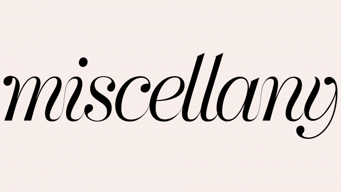
A minimalist yet elegant style with a claim to sophistication was chosen for the company logo. The conciseness of the visual reflection of the logo is ensured by the use of only the brand name, executed in an elegant handwritten font developed by the company. Its sophistication and grace echo favorably with the execution of typefaces in fashion magazines or on the products of leading cosmetic brands. The lightness and airiness characteristic of each letter of the created text ensure its uniqueness in the environment of geometrically perfect digital sans-serif fonts that are massively used in visual advertising and branding. Preservation of its visual properties in various dimensions of the use of the logo makes the perception and reading of the text quite easy and clear, favorably emphasizing the brand’s individuality.


