The Salesloft software from Modern Revenue Workspace™, developed in 2011, is presented today with updated functionality and visual identity. In the latest version, the multiple wishes of users were taken into account. Still, some errors were corrected, and functionality was added, and an upgrade was carried out based on the latest developments. The platform does the bulk of the administrative work, freeing up time for other tasks. It can process a lot of data in a short time, providing high accuracy of analytical information. The Salesloft interface contains all the basic tools you need to simplify your business. The functionality is placed conveniently for the user and is fully synchronized without causing conflict situations. Communication channels and the most important processes are also built-in here. Artificial intelligence quickly processes data and highlights the most profitable moments, directions, and transactions, ensuring a high degree of efficiency in the forecasts that lead to successful decisions.
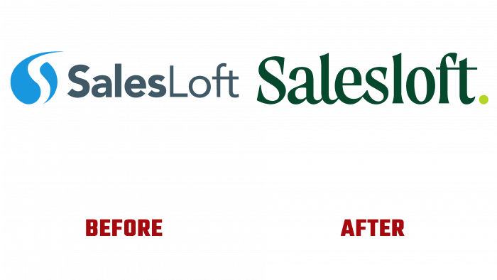
The changes that have taken place in the logo and style of the brand more clearly reflect its confidence, sincerity, and energy. Designed by Focus Lab (Richmond Hill, GA), the design and style reflect an important aspect of all platform developers’ actions – creating software that facilitates communication between people at a professional level, providing benefits to both parties. The new style successfully conveys energy, inspiration, and dedication, enhanced by the use of Salesloft.
The Moret typeface was used to form the text logo. Its visual effect was enhanced by using graphical connections between letters, reminiscent of a script, in the first part. The composition allows for dividing the name into two words – Sales and loft since the latter is distinguished by the absence of a link between the letters. This approach creates visuals informing the user about the ease of use of the platform, the absence of complexities, and special requirements for both the user and the scope of the platform. Such characteristics are the main difference between the design style of the same name.
The graphics ensured ease of reading, thanks to the clear execution of each letter, opening up wide possibilities for the application of the logo. The sign itself has become a convenient source for the formation of a monogram. Its elements fit easily and simply into small spaces, showcasing the first letter of the brand and the dot that completes the name on the emblem. The dark green background chosen for the text contrasts very favorably with its light shade of point execution. This move effectively switches the eye from one element to another, connecting with the monogram and increasing its visual recognition.


