Creating a unique network of bike paths has become one of the most important tasks of the Lyon metropolis. The project was named Les Voies Lyonnaises (there is a direct connection with the famous “Roman roads” of antiquity) and a corporate identity specially developed by the Spintank consulting company. Les Voies Lyonnaises is expected to provide the convenience and safety of cyclists within the city. Completing these high-speed tracks with a total length of 400 km is scheduled for 2030, making Lyon a true “bicycle paradise.”
Spintank has created all the elements of visual identity – a system of road signs, signage, logo. Together with the Parisian Yellow Window, the problem was successfully solved. The main emphasis was placed on the smoothness and comfort of movement, which provides cycling. The sign system has been designed to effectively assist indecisive cyclists in making quick decisions on difficult terrain.
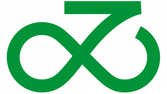
The designers managed to convey the required atmosphere that permeates all style elements – positivity, friendliness, inclusiveness. The system logo is a symbolic symbol located above the text. The sign very accurately conveyed the idea of smoothness of movement with its soft shapes. Formed in the mathematical symbol of infinity, it successfully reflected the idea of \u200b\u200bcycle paths. The sign is perceived as a stylized image of a bicycle with its rider in a holistic visual perception. It has become a symbol of the absence of borders for the constant development of such a network of cycle paths and the promising possibilities of travel along with them for any other type of small transport, scooters, etc. The letter “L” hidden in the graph reflected the project’s belonging to Lyon. The curves of the logo became the basis for the formation of other elements of visual identity.
Fatype’s Baton Turbo font was chosen as the typeface, which in its form very much resembled the “folk” version historically used by the French. In addition, the clarity of each of its letters ensured the ease of reading any text on signs, road signs. The title was done in two lines, leaving a lot of free space.
Green became the main color for the background – the personification of the connection with nature, creating safe conditions for the environment. In addition, the color symbolizes hope for people and the city, for creating a clean surrounding space through the choice of alternative, non-polluting transport.
Spintank has also designed the map icons and the current map of the directions and intersections of bike paths. Everything aims to create a comfortable and convenient use of such an important system of safe movement today.


