In the media, there was information about the completion of the city’s design of the future. Its symbol was the original logo, called the “Telos star.” The name and the idea of creating the project belong to the famous billionaire Marc Lore, who wished to create a unique education – “America’s new city” for 5 million inhabitants. It was taken from the designation of the meaning of existence, used by Aristotle as the concept of the highest ultimate goal of human efforts. The new city will have to combine the best features of modern cities and everything that has not yet been implemented. These are dreams of a city as clean as Tokyo, as diverse as New York, socially efficient as Stockholm, ergonomic, and environmentally friendly. Its main mission should be to create a just and stable future. The project was developed by the architect Bjarke Ingels, whose Scandinavian culture is reflected in the personification of the social and environmental concern for people at the heart of the project. At the same time, it also reveals wide opportunities that are more characteristic of the culture of the American type.
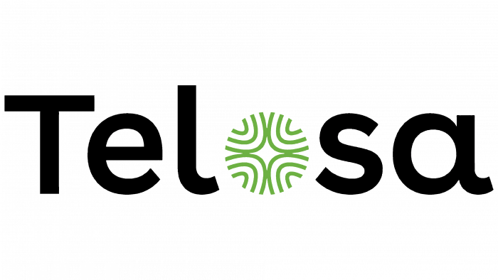
To reflect the purpose and meaning of the new formation, a unique symbol was created – the so-called Polar Star, which became the emblem of a unique city. Like its stellar counterpart for seafarers of the past, this logo is a guide for those who have undertaken such an important mission – to create a better place for living and conditions for people in a just and stable community of residents.
The logo contains a wide variety of semantic meanings, which are reflected in its graphic design. Its main shape was chosen as a circle, divided into four sectors. Each sector represents one of the pillars that shape the direction of Telosa’s development – the community of people, the governing body, the business sector, and community donations. The latter provides for the voluntariness of payment without the need for coercion for the received material values or services in the form of a created system for its subsequent development.
The circle formed by the logo elements does not have a physical bounding line of the circle. Its shape is determined only visually. Internal elements – 4 sectors are formed by figures representing the end part of unfinished semi-ellipses of different sizes. Their points of the contact form a stylized image of a star. The absence of closed, limited forms and the use of elements without sharp corners, straight lines characterize the three main values that are the foundation of the future city – openness, inclusiveness, and justice. At the same time, it symbolizes the openness of the new culture created together with Telosa. The absolute symmetry of each section in shape, size, performance speaks of the equivalence of each inhabitant to each other, fair coexistence in it, and the same accessibility for all to the most diverse opportunities.
The logo color is green. It is chosen as a demonstration of clean ecology. There will be no place for the use of fossil fuels and the chemical industry – only a healthy lifestyle and “green” energy in the absence of conditions for causing harm to the environment.


