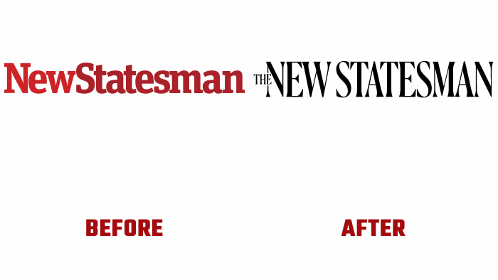
The British magazine on politics and culture The New Statesman, published in London on April 12, 1913, marked more than 108 years of history with style changes. Like all types of printing publications, which entered the third decade of the 21st century, the publication follows the requirements of the time and the need to use new technologies. Having become a hybrid print-digital, The New Statesman is one of the most influential and well-respected publications in Great Britain; it is forced to change despite its British conservatism. The changes also affected the external form of the brand – its logo, which changed dramatically and began to reflect the correct spelling of the name in English. The changes affected all areas of visual identity. The website has acquired elegance and ambition, completing the process of change brought about by expanding its reach – the international expansion of its eminent journalism.
The new design provides visual, informational, and digital support for this important event. It fully meets the requirements of modern digital and print technologies. The famous European designer Mark Porter took part in developing a new identity jointly with the publication team. The created new look has turned out to be modern, demonstrating “binding” to more than a century of the publication’s history. The font chosen for the logo has a classic feel and pure British elegance. Its creation was inspired by the publications of The New Statesman of the post-war period. The warm red color scheme was taken from the cover of the 1958 edition, which was first released in color at the time.
In contrast to the early logo, its successor included the definite article “The” in the spelling, which “found” its place in the middle of the left leg “N.” Thus, the problem of the visual overload of the title was solved. The composition itself has benefited immensely from these changes, becoming less ponderous and more readable.
The shaping of the design was strongly influenced by the desire to equally convey the aesthetic and functional side of the brand’s appearance. You can evaluate the result by visiting the company’s website, which has not only experienced visual changes but has become simpler, adaptive, with intuitive functionality. Its revision took into account the readers’ wishes and was redesigned, taking into account the comfortable use for them.


