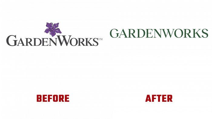
GardenWorks, a community garden center retailer based in Burnaby-Lougheed, British Columbia (BC), has unveiled its original new style. Founded in 1985, today, the brand has gained worldwide fame for its extraordinary collection of proposals. The assortment of garden centers includes a wide variety of beautiful garden and indoor plants, original garden ceramics and accessories, unique decorative items for decorating various types of premises. For the correct selection and combination of plants, decor items, the company provides its visitors with the services of professional consultants.
The company’s new corporate identity is the desire to create a timeless identity, independent of the current changes in the world and society, in the preferences and consciousness of people. The presented version from the Rethink design agency unites people and the natural world in its non-standard design. The logo itself has completely changed. It has become simple, laconic with the presence of freedom and “air” created by a large volume of negative space, in which only the name of the brand is placed. The visual harmony of the combination of the logo with other elements is ensured by the lower case type Janson URW SC by URW Type Foundry. This construction allows you to use various details on a free background, using the logo in all possible combinations with other image elements. It goes well with the printing and advertising products of the company, is readable, and is easy to remember when placed on the pages of the company’s website, on digital media.
The desire to universalize their style and combine the past and the present has created a unique combination of modern minimalism and Victorianism of the late 19th and early 20th centuries. The latter was especially common in the printing industry of that time when printing greeting cards. These cards inspired the developers to create a unique image – the symbol of the company. It features the capital letter of the brand name in white on a dark green background, chosen as the color for the corporate identity. Through the letter, “a beautiful rose grows, made in the color of the brand, but with black contours, which emphasize the beauty of the forms of the stem of fresh leaves, the open and still closed bud. The lettering stands out very clearly against this background, becoming an accent element. The brand takes on a unique and elegant look combined with hand-painted plant images from GARDENWORKS Garden Centers. However, this combination of black and dark green adds gloom to the overall visual identity aesthetic.


