The unique American system of electronic forecasting: Faraday appeared in front of its users in an updated form. The closure of Serie A necessitated the creation of the Faraday system in 2012. The modern platform is designed to get real forecasts for trading, based on which you can plan, adjust your actions, and form a future strategy. With the help of the platform’s artificial intelligence, every brand, agency, SaaS in just four simple steps will be able to ensure its growth easier, faster, and more thoughtfully and ensure the correct adoption of successful decisions for the future. With a massive amount of data on 300 million US adult consumers, intelligence will find the best cohort for the products, services, and offerings of the respective destinations. At the same time, confidentiality is not violated, and the level of security is at the highest level.
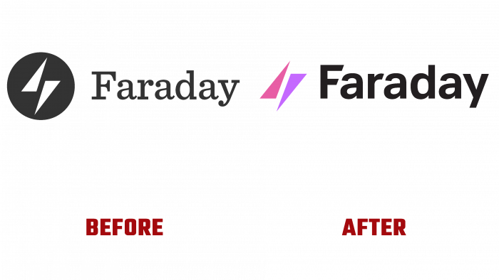
The transition to a new visual identity has retained the brand’s “totem” as a symbolic sign that characterizes a lightning bolt. It is he who directly connects the name of the platform with the famous experiments of Michael Faraday’s. The up and down arrows are a symbol of the binary classification foreseen by Faraday, as well as a stylized image of an electric discharge from the scientist’s experiments. In the new version, the arrows have acquired color and free space around them, making them more noticeable and eye-catching. Colors similar in tonality add dynamism to the image and signal the brand’s prosperity in its field.
Lee Williams contributed to the typeface. In addition to changing its type to Caliber and Aktiv Grotesk from Dalton Maag, its graphic revision was made – a cut at the same angle of the lateral endings in 2 letters – “F” and “r.” This provided visual compositional consistency and text consistency based on vertical type. Aktiv Grotesk is different from new technology and belongs to the type of variables. It includes the features of many different fonts, thanks to various variable changes within it.
About the color palette, it was decided to keep it consistent with the old version. Thus, the adaptation of the new logo was facilitated without abrupt transitions. This allowed us to keep some of the visual elements unchanged. In addition, the new style has acquired many photographs since the essence of Faraday is predicting behavior. After all, it is real people who perform real actions. Thanks to a new concept – the use of photographic illustrations, it was possible to focus attention on behavioral characteristics.


