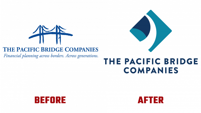
Founded by Stephen Kagawa in 1992, The Pacific Bridge Companies (TPBC), a financial consulting group, reorganized its logo. As an organization for consulting, assisting individuals and businesses in the financial industry, it was created to connect Japan’s citizens and business partners and the United States. Today, this association spans the United States, Asia, and Pacific Rim, positioning itself as a financial consulting “bridge across the Pacific,” symbolized by the organization’s past logo. By the founder himself, the organization’s mission is determined by the provision of effective assistance to financial consultants who “love their work.”
The new visual identity symbolizes every Hawaiian family – the calabash bowl, which is an ancient way of keeping family jewelry. In ancient times, a tradition required each family member to make a weighty personal contribution to this vessel. The Polynesian Bowl is a place of abundance, illustrates the history of the brand’s origin, and symbolizes the close, like family ties, cooperation that brings abundance and success. At the same time, it demonstrates an important condition for success – the obligatory presence of investments of effort, labor, energy from each participant to achieve the required result. This approach to a new corporate identity creates the desired perception of the organization as a place where the “abundance” of financial consultants can be found. At the same time, they are distinguished by talent, unique abilities, and vast experience. Each of them can strengthen and support with their advice and actions all who turn to TPBC services.
The Ohana Bowl perfectly reflects the true spiritual meaning of the company – TPBC is a source of energy and strength for all participants, especially advisors who purposefully interact and unite different sides of participants in financial transactions with their professional actions. Structurally, the logo is a square, standing on one of its vertices, into which a bowl is inscribed, partially hidden behind the left border of the figure. Blue was retained as the background color. For clarity of perception of the composition, the upper rim of the calabash is made in white, which, as it were, breaks the lower borders of the square. The inner wall of the vessel, like the font under the sign, is made in dark blue. Under the square, there is an inscription in lower case – the full name of the company.


