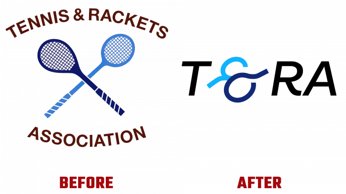
For the first time in its history, the Tennis and Racket Association (T&RA), founded in 1907 and headquartered at Queen’s Club in West Kensington, London, underwent a complete rebranding. The decision was made during a pause in the competition due to the pandemic. Despite the tragedy of the situation, epidemiological restrictions have made it possible to pay attention to a long-overdue issue – the change in the visual identity of the association. Its development was entrusted to a young but already successful design agency – Hello Morning.
It was important for the designers to reflect the key goals of the association – attracting sponsors, increasing the number of participants. At the same time, it was required to focus on the dynamism and energy carried out under her auspices of the games. At the same time, more than 600 years of history of the sport itself could not be ignored, providing a harmonious visual unification of the past, present, and future of tennis, where the slogan “A future built on historian” speaks for itself. All of this, as conceived by the T&RA leadership, should demonstrate the association’s commitment to forward, based on a centuries-old heritage.
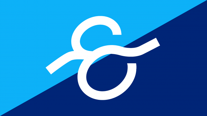
The creativity of the Hello Morning team has brought about a radical redesign of the logo in a modern style while maintaining the brand’s historical spirit. The rejection of the overload of the image, the desire for brevity, and the observance of minimalism were reflected in the use of only the abbreviation of the name of the association instead of the full text. The original solution was to replace the “&” sign with its symbolic image using two crossed rackets. In this way, both a powerful visual impact and the breadth of information delivery in such a simple compositional sign were provided. Crossed rackets are a polysemantic symbol. This is a general indicator of the unity of the two gaming directions covered by T&RA, their commonality, and fusion. As well as the equal responsibility of the association and its inclusiveness.
In keeping with the need to reflect a commitment to its history, the brand’s logo has retained two primary shades of blue – dark and light. But to create a dramatic accent, the new emblem takes on three bold and bold colors throughout the brand’s image elements. They refresh the look, and at the same time, highlight the main two shades, attracting everyone’s attention.
The acronym is written in a modern bold italic typeface Ambit by CoType Foundry. This performance emphasizes the brand’s sporty style and makes it easy to read. Tilting to the right adds dynamics, bringing the text to life more interesting and engaging. Everything was done to shift the emphasis of the new visualization to the games themselves and their features.


