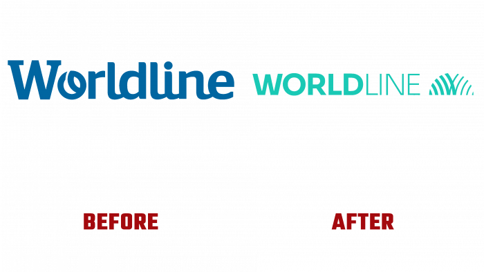
Worldline, a French multinational financial payment and transaction provider, has unveiled its new identity. Having started its activity back in 1970 under Sligos, already in 1973, it absorbed Sliga (from Crédit Lyonnais) and Cegos, significantly increasing its capacity. Further expansion took place until 2013, when, formed in 2004, Atos Worldline provides Worldline with autonomy in running its own business. 2019 becomes the year of complete independence of the company, which continues to form a new group of companies in its composition until the beginning of summer 2020.
All current events aimed to expand functionality and provide the consumer with the best opportunities in their field of activity. Also, the created system of the leading consolidators in the payment industry Worldline and improved coordination – the main goal of the updated Worldline required a radical change in the design of its style. An important point in the company’s rebranding was the reflection of the formation of the brand’s globality, which took place in the process of many years of active integration of companies in various directions.
The new style ensured creating a unique architecture under which all the brands included in the group are harmoniously united. The style was based on the updated logo, which retained the common name – Worldline as a tribute to the history of this formation. The text is in lower case, without spaces, characterizing unity and stability. Separate perception of the two words that make up the name of education was provided graphically. The first World is written in a bold type Integral CF Regular. The second is subtle. A font like Eurostile Next Light has been used here. In a single turquoise color, the brand name looks quite nice and attractive. At the same time, this shade refers the viewer to a color that symbolically characterizes the money supply.
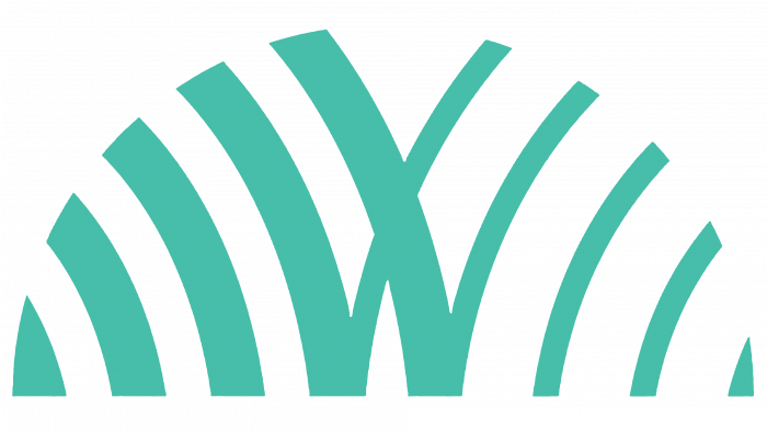
Enhances the visual impact and the formation of attractiveness with a sign that follows the text, demonstrating the brand’s know-how, talent, and creativity inherited from each of the members of their group. It is a horizontal semicircle in the same color as the fonts. It is made in arcs bent to the right and the left, starting from a single base—each segment with its curved top forms part of a circular arc. The thicknesses make them of the two parts of the name. At the same time, two central segments visually form the first letter of the brand name – “V.” This sign with a common symbol is an original demonstration of the successful globalization of the brand.


